Translate

Tuesday, November 7, 2017

Caned Dance, 1974 by Bruce Nauman


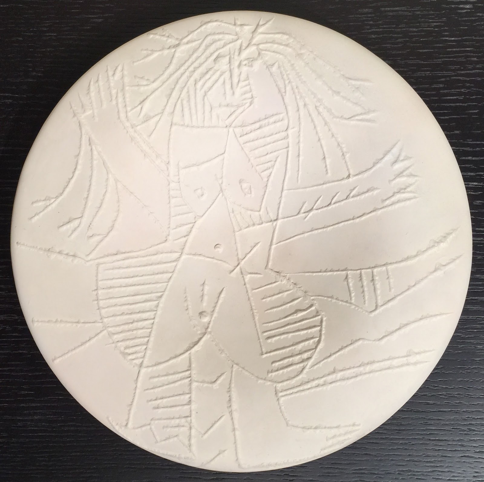
Caned Dance, 1974; Lithograph on Arches paper; Signed B Nauman, numbered 9/100, and dated 74 lower right; Co-published by Multiples Inc. and Castelli Graphics, New York; Size - Sheet: 22 x 30"; Unframed. 

To purchase this work or to visit the Art Gallery, CLICK HERE!     

"I'm surprised when the work appears beautiful, and very pleased. And I think work can be very good and very successful without being able to call it beautiful, although I'm not clear about that. The work is good when it has a certain completeness, and when it's got a certain completeness, then it's beautiful." - Bruce Nauman

Bruce Nauman is an American artist who has worked for over three decades in a variety of media including: photography, performance, drawing, sculpture, photography, video, neon, sound, and printmaking among others. Nauman is regarded as one of the most important artists working today, and his work is collected by all the major art museums of the world.

A large amount of his artwork is characterized by the use of language, that will often manifest itself into mischievous, odd, or playful ways; often pitting the metaphoric and definitive nature against each other. He will also manipulate the interaction of words through the use of puns, palindromes, anagrams, and repetition. Nauman is also interested in the pitfalls of language as a means of communication, control, and the artistic manipulation of visual symbols.

Nauman collaborated with the famed dancer and dance instructor Merce Cunningham. Cunningham's work from 1970 entitled "Tread" is a lighthearted work, that was described by Patrick O'Connor as "sometimes hilarious and always good-humored piece" in which "the dancers get into some extraordinarily complicated physical entanglements." Don McDonagh described the rehearsal, "it begins quietly, with the company seated, and then works up to a humorous set of catches, lifts, and fast exits and entrances which resemble a French bedroom farce. At the finish, the work returns to its original, tranquil state." "Tread," 1970 was another piece that Cunningham collaborated with other visual artists in order to join multiple artistic disciplines. Jasper Johns, who had previously worked with Cunningham, invited Bruce Nauman to design the set for "Tread," which consisted of ten large industrial fans that were aligned in a row across the front of the stage. The fans were set to oscillate, and they rotated from left to right; blowing air out into the audience.


Close up of the Bruce Nauman signature, edition number, and the date.


"Caned Dance" is a spectacular work by Bruce Nauman that deals with language, most directly with words that relate to performance. The word "Dance" is preceded by "Caned" creating in the mind's eye a series of dance movements involving a cane being used as a prop. The entire work of art is composed using brushstrokes of three colors; pink, yellow, and green. The unpainted cream paper and yellow brushstrokes make up the capital letters of the two words. Choice of colors and the way in which the colors are applied create an optical effect that obfuscates the text, and veils the words as being instantly read and understood by the viewer. This work was initially published and sold in order to raise funds for the Merce Cunningham Dance Company in New York. This is a beautiful original hand signed work of art by Bruce Nauman and a great addition to any art collection!

Friday, November 3, 2017

Merce Cunningham I, 1974 by Andy Warhol


Merce Cunningham I, 1974; Screenprint on Japanese gift wrapping paper; Signed Andy Warhol and numbered 9/100 in pencil verso; Co-published by Multiples Inc. and Castelli Graphics, New York; Size - Sheet 30" x 20"; Catalogue Raisonne: Feldman/Schellmann: II.124; Unframed. 

To purchase this work or to visit the Art Gallery, CLICK HERE!     

"I never wanted to be a painter, I wanted to be a tap dancer." - Andy Warhol

Merce Philip Cunningham was an American dancer and choreographer was a leader in field for over 50 years. He is also remembered for his collaboration with other artists in other mediums including: John Cage, Robert Rauschenberg Bruce Nauman, Jasper Johns, and Andy Warhol.

Merce Cunningham recalls seeing artwork by Andy Warhol: "I was with Jasper Johns at an exhibition and Andy's pillows were just piled in a corner. I immediately thought they would be marvelous on stage because they moved, and they were light, and they took light. So I asked Andy and he said, 'Oh sure.' Some of the pillows were filled with air - they stayed on the floor - but some were filled with helium and they floated. The dancers had to understand the technique of working with them; you had to push, not kick, to get them to float. When we first did "RainForest" they had only one rehearsal with the pillows, and a lot went into the audience."


Close up of the Japanese Flower Gift wrap paper.

The dance performance "RainForest" premiered on March 9, 1968 at the Buffalo State College in New York. The title is a reference to childhood memories that Cunningham had of the Northwest and of the Olympic Peninsula. The dancers wore flesh colored leotards and tights that were cut with a razor blade by Jasper Johns to give the costumes a rougher appearance.


Close up of the Andy Warhol signature and the edition number.


This is a very rare full figure profile portrait of Merce Cunningham by the great Pop artist Andy Warhol. The image shows Cunningham wearing tights and leaning forward while balancing a chair behind him. This is a wonderful image of the famed dancer, in a striking and majestic pose. The image has been screened onto a sheet of brightly colored Japanese flower gift wrap paper, which provides a brilliant backdrop that is reminiscent of Cunningham's desire for an artistic background. This work was initially published and sold in order to raise funds for the Merce Cunningham Dance Company in New York. This is a beautiful original hand signed work of art by the Pop artist Andy Warhol, and a portrait of one the twentieth century's most influential dancers. A great addition to any art collection!

Thursday, August 17, 2017

:Quanta, 1982 by Joseph Beuys


:Quanta, 1982; Serigraph on two sheets of Rives BFK White Paper; Signed Joseph Beuys and numbered 20/75 in pencil lower right of second sheet; Published by Anthology Film Archives, New York; Printed by Porter-Wiener Studio, New York; Catalog Raisonne: Schellmann 448; Size - Each sheet: 13 1/2 x 10"; Unframed.

To purchase this work or to visit the Art Gallery, CLICK HERE!

"Every human being is an artist, a freedom being, called to participate in transforming and reshaping the conditions, thinking, and structures that shape and inform our lives." - Joseph Beuys 

Joseph Beuys (1921-1986) was a politically active artist who was involved in large-scale installations, happenings, sculpting, graphic arts, as well as a performance artist who expressed positions on contemporary issues. He was a member of the Fluxus Art movement, known for experimental contributions to different artistic media and disciplines, and one of the greatest influential artists of the twentieth century.

":Quantum" is a serigraph on paper in two parts. Each sheet is printed in two colors; grey used to depict graphite notations, and gold. Gold was a color and form that was used extensively by Beuys for his artistic output, and was a recurring part of his lexicon. Gold's significance was it's application in alchemy, as well as the idea that ordinary objects could be transformed to a higher state of value. The right sheet shows three columns; two running the full height of the printed image, and a third that is about a fifth the height of the other two. The gold gilt is used as a "white out" as it obliterates most of the notations in the columns. Numbers and lines are visible, but it is not apparent whether they were left uncovered or were added after the gold was applied. The Beuys drawing vocabulary is described by art critic Athur Danto as "unmistakably his, blobs and blots in sepia or brown, on throwaway paper, and connected by some desultory scribbled lines."


Right sheet of :Quanta, 1982 by Joseph Beuys.

The left sheet appears as a column of words and phrases in German, most illegible; due to Beuy's uneven and loose handwriting. Examples of legible words are: Pilze, buch, pelt, Eichel, felsen, fels which translate as fungi, book, pelt, acorn, rock, and cliff. These refer to aspects of the physical world, which were key vocabulary terms and central to Beuy's artistic production, sociopolitical consciousness, and commentary. Art critic Rober Hughes has stated, "His obsessive interest in shamanism and the invocation of animal totems - hare, bee, stag, and the like, scribbled out in countless drawings, molded in wax, and scratched like Klee or Franz Marc than it does with real anthropology, despite Beuy's insistence on the need for an 'anthropological' art which could give ordinary human actions the character of ritual."


Left sheet of :Quanta, 1982 by Joseph Beuys.
The print's title "Quanta" translated from German means quantum, a discrete quantity of energy proportional in magnitude to the frequency of the radiation it represents. This is a strong reference to the atomic bomb; which directly affected Beuys when he became a prisoner of war in England in 1945 when Germany surrendered.


Close up of the Joseph Beuys signature and edition number.
On the bottom left is a printed inscription "to John Cage with love and admiration. Joseph." In the early 1960's Joseph Beuys, through the Fluxus art group, met and became aware of the work of the American avante-garde composer John Cage. Their connection was specifically through the artist Nam June Paik. Paik. Paik was still a composer when he attended a 1958 John Cage performance in Darmstadt, which would prove transformative for Nam. Paik emerged from the performance vowing to become an artist. He would go on to create the piece "Hommage a John Cage," which concluded with the intention of "overthrowing" the piano. Paik stated "The piano is a taboo that must be destroyed." Later in an exhibition in Wuppertal, Paik showed four prepared pianos and at the time, a little-known artist named Joseph Beuys, destroyed one of them. This was a defiant act, that not even Paik had ever accomplished. Cage, Paik, and Beuys would become lifelong friends and collaborators. When asked in an interview what artists he was closest, Beuys answered, "John Cage. These concepts are not alien to him."
This is an absolutely wonderful original work by Joseph Beuys, who was one of the centuries greatest influential artists. There are numerous references to Beuys symbolism, artistic vocabulary, and a direct attribution to one of his significant collaborators. An important signed and numbered artwork, perfect for any modern art collection.

Friday, August 4, 2017

Femme Echevelee (Dishevelled Woman), Ceramic Plate 1963 by Pablo Picasso


Femme Echevelee (Dishevelled Woman), 1963; Unglazed white earthenware plate; Numbered 4/100 and marked T.103 in ink, with the 'EMPREINTE ORIGINALE DE PICASSO' and 'MADOURA PLEIN FEU' pottery stamps on the verso; Catalogue Raisonne: A.R. 510; Size - Plate: Diameter 10 1/2"; Unframed.


During the late 1940s, Pablo Picasso spent the summers on the Cote d'Azur in the South of France. There the artist visited Vallauris for the annual pottery exhibition in 1946. He was impressed by the quality of the Madoura works and was introduced to the owners, Suzanne and Georges Ramié. The Ramiés welcomed the famous artist into their workshop and gave him access to all the tools and resources the he needed in order to work in the medium of ceramics. In exchange, the Ramié family would produce and sell his limited edition ceramic works and this relationship spanned 25 years. It was also at the Madoura factory in 1953 that Picasso met Jacqueline Roque, who would become his second wife in 1961.


Back of Femme Echevelee (Dishevelled Woman), 1963 by Pablo Picasso.

The Market for Picasso ceramics has been steadily rising as outlined by a recent article:
"Over the past 10 years, the market for Picasso ceramics has steadily grown, with seasoned collectors and new buyers alike vying for Picasso's editioned and unique ceramics at auction. This market is stable, with a steady high sell-through rate around 89% (87% in 2004, 89% in 2005, 87% in 2011, and 90% in 2012), and prices that are still lower than the rest of Picasso's work. The broad range of estimates and sales prices help make this market attractive to many collectors, but also explain the high average sales prices, which are skewed by a few exceptional pieces. In the previous two years, more than 60 exceptional ceramic works sold for over US$100,000: 34 in 2011 and 29 in 2012 (vs. six in 2004 and 2005)." - The Story Behind Picasso Ceramics, by Fanny Lakoubay and Conner Williams, 2013


Close up of the edition number, 'EMPREINTE ORIGINALE DE PICASSO,' and 'MADOURA PLEIN FEU' pottery stamps.

The famed artist Georges Bloch stated of Picasso’s ceramic works:
 "…in approach, material and technique is as novel as it is interesting. Pottery, gleaming white discs with relief designs, monochrome or brightly coloured ovals, dishes and even jugs and vases here serve as bearers of compositions whose themes express the joyous, life-loving side of Picasso’s work. They are printed from blocks and stamps fashioned by the master over a period of more than twenty years in the Madoura pottery workshop in Vallauris.”

This is a large 10 1/2" diameter original ceramic plate by Picasso. The monochromatic image is instantly recognizable as from the hand of Pablo Picasso. The female nude is an analytical cubist construct, situated in landscape. Her arms and long hair are waving in the wind, and she is defiantly facing the viewer. An absolutely wonderful piece of original Pablo Picasso artwork, perfect for any collection!

Friday, June 16, 2017

Circle II, I-7, from Handmade Paper Project, 1978 by Kenneth Noland


Circle II, I-7, from Handmade Paper Project, 1978; Handmade paper composed of five layers of colored paper pulp with one monotype litho printing; Signed & dated Noland 78 in pencil bottom right; Published by Tyler Graphics, Ltd., Bedford, New York, with their blindstamp lower right; Annotated I-7 in pencil left verso; Size - 21 x 32", Frame 34 1/2 x 44 1/2"; Framed with a black wood frame, floated and acid free matted, and plexiglass.

To purchase this work or to visit the Art Gallery, CLICK HERE

"I knew what a circle could do. Both eyes focus on it. It stamps itself out, like a dot. This, in turn, causes one's vision to spread, as in a mandala in Tantric art." - Kenneth Noland

In October of 1952 Helen Frankenthaler, after a trip to Nova Scotia, had a breakthrough with a painting entitled "Mountains and Sea." The painting was abstract and rather than painting the landscape that she saw on her trip, the work portrayed the experience itself. The abstract image was painted using a "soak stain" technique, whereby unprimed canvas duct is painted using oil paint that had been heavily thinned with turpentine. The effects of the technique reinforced the abstract nature of the landscape painting; and when the artists Kenneth Noland and Morris Louis saw it in her studio in New York, their own painting styles were forever changed.


Close up of Circle II, I-13, from Handmade Paper Project, 1978 by Kenneth Noland.

On the train ride back to Washington DC, Noland and Louis realized that Frankenthaler's painting was their key to finding their own paths. Each made the decision to disregard all his own prior work and begin fresh. Noland stated, "We were interested in Pollock but could gain no lead from him. He was too personal. But Frankenthaler showed us a way - a way to think about and use color." Morris Louis found is structure for his color field paintings first with the unfurl series; and soon after Kenneth Noland found his, with the circle paintings. "I knew what a circle could do. Both eyes focus on it. It stamps itself out, like a dot. This, in turn, causes on's vision to spread, as in a mandala in Tantric art," Kenneth Noland.


Close up of the signature, date, and Tyler Graphics, Ltd. blindstamp.

The circle paintings in the 1960's were Noland's first color format; but would be followed over the years by chevrons, strips, plaids, and irregular paintin series. Noland would return to these early formats in the 1990's using opaque and bold acrylics, however the soak stain technique from the 1960's are by far his greatest achievement.

From Judith Goldman "Kenneth Noland Handmade Papers," 1978:
"From April to August 1978, Kenneth Noland made images out of paper at Tyler Graphics in Bedford, New York. Working with oriental and western fibers and bits of colored paper, he produced oer 200 images. The results were staggering. At first glance, many images seem quite like each other. But no two are the same. Colors vary from filmy blues and bright yellows to soft purples and murky greys. Textures range from wafer-thin oriental surfaces, thick as encrusted cardboard. In some pieces image prevail; in some, structure does. Paper-making is never the point, for Noland, it is a way to explore color and create texture."


Close up of the annotated I-7 in pencil left verso.

The handmade paper works of art completed at Tyler Graphics fall into four categories. The Circle I Series were composed of three layers of colored pulp with three monotype litho printings. The sheet size was 20 x 16" oriented either vertical or horizontal. The Horizontal Stripes Series I-IV were varied by both size and the number of layers of colored pulp. The Diagonal Stripes Series were composed of eight layers of colored pulp. However, the greatest works of art created within the entire handmade paper project were the Circle II Series of artworks. These pieces were his larges circles, and it this format of color field painting that Kenneth Noland is most recognized. The Circle II Series were composed of five layers of colored pulp with one monotype litho printing. The sheet size was 32 x 21" oriented either vertical or horizontal.


Framed Circle II, I-13, from Handmade Paper Project, 1978 by Kenneth Noland.

This is an absolutely amazing Handmade Paper Circle Painting by Kenneth Noland! The inner circle is a soft pink red with outward circles of red, grey, white, and black. The ground is a rich washed grey; that further enhances the interactions of the color fields, overall composition, and balance. To further activate the surface, there are colored fibers and bits of green paper scattered throughout the work. A beautiful addition to any art collection!

Friday, June 9, 2017

Circle II, I-13, from Handmade Paper Project, 1978 by Kenneth Noland

Circle II, I-13, from Handmade Paper Project, 1978; Handmade paper composed of five layers of colored paper pulp with one monotype litho printing; Signed & dated Noland 78 in pencil bottom right; Annotated I-13 in pencil left verso; Published by Tyler Graphics, Ltd., Bedford, New York, with their blindstamp lower right; Andre Emmerich Gallery sticker on verso of frame; Size - 21 x 32", Frame 22 x 33"; Framed floated on a white mat, silver frame, & plexiglass.
To purchase this work or to visit the Art Gallery, CLICK HERE

"I knew what a circle could do. Both eyes focus on it. It stamps itself out, like a dot. This, in turn, causes one's vision to spread, as in a mandala in Tantric art." - Kenneth Noland 

In October of 1952 Helen Frankenthaler, after a trip to Nova Scotia, had a breakthrough with a painting entitled "Mountains and Sea." The painting was abstract and rather than painting the landscape that she saw on her trip, the work portrayed the experience itself. The abstract image was painted using a "soak stain" technique, whereby unprimed canvas duct is painted using oil paint that had been heavily thinned with turpentine. The effects of the technique reinforced the abstract nature of the landscape painting; and when the artists Kenneth Noland and Morris Louis saw it in her studio in New York, their own painting styles were forever changed.


Close up of Circle II, I-13, from Handmade Paper Project, 1978 by Kenneth Noland.

On the train ride back to Washington DC, Noland and Louis realized that Frankenthaler's painting was their key to finding their own paths. Each made the decision to disregard all his own prior work and begin fresh. Noland stated, "We were interested in Pollock but could gain no lead from him. He was too personal. But Frankenthaler showed us a way - a way to think about and use color." Morris Louis found is structure for his color field paintings first with the unfurl series; and soon after Kenneth Noland found his, with the circle paintings. "I knew what a circle could do. Both eyes focus on it. It stamps itself out, like a dot. This, in turn, causes on's vision to spread, as in a mandala in Tantric art," Kenneth Noland.


Close up of the signature, date, and Tyler Graphics, Ltd. blindstamp.


Close up of the annotated I-13 in pencil left verso.

The circle paintings in the 1960's were Noland's first color format; but would be followed over the years by chevrons, strips, plaids, and irregular paintin series. Noland would return to these early formats in the 1990's using opaque and bold acrylics, however the soak stain technique from the 1960's are by far his greatest achievement.


Framed Circle II, I-13, from Handmade Paper Project, 1978 by Kennthe Noland.

From Judith Goldman "Kenneth Noland Handmade Papers," 1978:
"From April to August 1978, Kenneth Noland made images out of paper at Tyler Graphics in Bedford, New York. Working with oriental and western fibers and bits of colored paper, he produced oer 200 images. The results were staggering. At first glance, many images seem quite like each other. But no two are the same. Colors vary from filmy blues and bright yellows to soft purples and murky greys. Textures range from wafer-thin oriental surfaces, thick as encrusted cardboard. In some pieces image prevail; in some, structure does. Paper-making is never the point, for Noland, it is a way to explore color and create texture."


Close up of the Andre Emmerich Gallery sticker on verso of frame.

The handmade paper works of art completed at Tyler Graphics fall into four categories. The Circle I Series were composed of three layers of colored pulp with three monotype litho printings. The sheet size was 20 x 16" oriented either vertical or horizontal. The Horizontal Stripes Series I-IV were varied by both size and the number of layers of colored pulp. The Diagonal Stripes Series were composed of eight layers of colored pulp. However, the greatest works of art created within the entire handmade paper project were the Circle II Series of artworks. These pieces were his larges circles, and it this format of color field painting that Kenneth Noland is most recognized. The Circle II Series were composed of five layers of colored pulp with one monotype litho printing. The sheet size was 32 x 21" oriented either vertical or horizontal.

This is an absolutely amazing Handmade Paper Circle Painting by Kenneth Noland! The inner circle is yellow, with outward circles of orange, red, pale red, and blue. The ground is a rich sea foam green, that further enhances the interactions of the color fields, overall composition, and balance. A wonderful addition to any art collection.

Monday, May 8, 2017

"Danseuse Debout, Acoudée (Standing Dancer, Leaning)," 1927 by Henri Matisse


Danseuse Debout, Acoudée (Standing Dancer, Leaning), 1927; Lithograph on Japon paper; Signed Henri Matisse and numbered 15/15 in pencil lower right; Published by Galerie D'Art Contemporain de Paris; Catalog Raisonne: Duthuit 482; Size - Image 18 x 11"; Sheet 19 1/2 x 12 3/4", Frame 32 3/4 x 25 1/2"; Framed with a gold wood frame, two acid free linen mats, a gold fillet, and UV Plexiglass.

To purchase this work or to visit the Art Gallery, CLICK HERE!

"What I dream of is an art of balance, of purity and serenity devoid of troubling or depressing subject matter - a soothing, calming influence on the mind, rather like a good armchair which provides relaxation from physical fatigue.” – Henri Matisse

Henri-Émile-Benoît Matisse (1869 – 1954) was a French artist who was known for both his use of colour and his original draughtsmanship. He is commonly regarded, along with Pablo Picasso, as one of the twentieth century’s greatest artists who redefined the visual arts of painting and sculpture. Although he was initially labelled a Fauve (wild beast), by the 1920s he was increasingly being hailed as a leader in the classical tradition of French painting. His artistic creation spanned over a half-century, and he is now considered a leading figure in the modern art movement.

Although Matisse is better known as a painter and sculptor, he became an avid print maker starting in 1906. His preferred medium was lithography, which he utilized in the creation of illustrations for books and over 100 original limited edition lithographs. The majority of the lithographs were executed in black and white, thus maintaining the sense of spontaneity and intimacy inherit in his pencil drawings. As with his paintings and sculptures, original lithographs are currently in world renowned permanent collections of major private and public institutions; including the Museum of Modern Art in New York, Tate Modern, and the Guggenheim.


Close up of the edition number and the Henri Matisse pencil signature.

Framed image of "Danseuse Debout, Acoudée (Standing Dancer, Leaning)," 1927 by Henri Matisse.

"Danseuse Debout, Acoudée (Standing Dancer, Leaning)," 1927 is a wonderful lithograph with the subject being a beautiful ballet dancer wearing a fitted flower covered bodice and a crinoline tutu that is tied at the waist with flowers and a bow. The artwork is instantly recognized as being from the hand of Matisse, as it is executed in his loose drawing style. One only need to look at the subject's face to see Matisse's great economy of lines, that form a balanced composition. The use of contour and value, in order to convey both a sense of softness and depth, makes the execution of the artwork exceptional. The standing dancer is leaning with her head resting in the palm of her right hand. Her gaze is fixed into the distance, implying a daydream state; and she does not appear to notice that she is being seen by the viewer. Her background is abstracted and washed out, focusing the attention only on the beautiful ballerina. The resulting composition is relaxed and calm, creating a peaceful daydream like escape for both the subject and the viewer. This is a spectacular, large, rare, and early work by Henri Matisse; and a great addition to any art collection!

Tuesday, May 2, 2017

"Portraits Of The Artists," 1967 by Andy Warhol


Portraits Of The Artists, 1967; Screenprints on 100 polystyrene boxes in ten colors; Incised initials AW & numbered 152/200 in the Warhol lower right blue box; Artists left to right: Lee Bontecou, Frank Stella, Larry Poons, Robert Morris, Donald Judd, Robert Rauschenberg, James Rosenquist, Roy Lichtenstein, Jasper Johns, & Andy Warhol; Published by Tanglewood Press, Inc., NY; Size - 20 3/4 x 20 3/4 x 1 1/2"; Catalog Raisonne: Feldman/Schellmann: II.17; Framed in a plexibox.


"My fascination with letting images repeat and repeat - or in film's case 'run on' - manifests my belief that we spend much of our lives seeing without observing." - Andy Warhol

Andy Warhol became part of a very exclusive group of artists that the famous and influential New York dealer, Leo Castelli, represented. Castelli (1907 - 1999) was an Italian-American art dealer. His New York gallery showed modern and contemporary artwork for five decades. Among the art movements which were covered included: Surrealism, Abstract Expressionism, Neo-Dada, Pop Art, Op Art, Color Field, Hard-edge Geometric, Lyrical Abstraction, Minimalism, Conceptual Art, and Neo-expressionism.


Close up of the Andy Warhol incised initials, A. W.


Close up of the edition number 152/200.

In 1967, David Whitney organized an exhibition to commemorate the tenth anniversary of the Leo Castilli Gallery. The show was entitled "Leo Castelli Ten Years," was held February 4-26, and included sixteen gallery artists. Andy Warhol's contribution (who came to the gallery late, after having two shows at Eleanor Ward’s Stable Gallery) to the show was a series of individual canvas portraits of twelve of the gallery artists: Lee Bontecou, John Chamberlain, Frank Stella, Larry Poons, Robert Morris, Donald Judd, Robert Rauschenberg, James Rosenquist, Roy Lichtenstein, Jasper Johns, Cy Twombly, and himself. The photographs of the artists were provided by the Castelli Gallery and Warhol then both cropped and enlarged them to created a silkscreen. The individual portrait images were then screened onto single colored canvases and were hung in the gallery foyer.


Close up of the top four rows of "Portraits Of The Artists," 1967 by Andy Warhol.

In early 1967 Tanglewood Press published a Portfolio entitled "Ten Faces of Leo Castelli," also to commemorate the tenth anniversary of the Leo Castilli Gallery. Warhol's contribution was a variant of his work for the Castelli exhibition. The work was entitled "Portraits of the Artists" and depicts the same portrait images of ten of the Castelli artists (Chamberlain and Twombly were not included). Warhol screenprinted each portrait using black ink onto ten different colored 3-D polystyrene boxes, each measuring approximately 2” x 2”. The boxes were then put into a frame, but they were not attached to each other; thus allowing the owner to rearrange the boxes in any order (Note: The order pictured seems to be the original published orientation). The framed 100 boxes form a square work of art approximately 20” x 20” and the artists pictured here are left to right: Lee Bontecou, Frank Stella, Larry Poons, Robert Morris, Donald Judd, Robert Rauschenberg, James Rosenquist, Roy Lichtenstein, Jasper Johns, and Andy Warhol.


Close up of the bottom six rows of "Portraits Of The Artists," 1967 by Andy Warhol.

"Portraits Of The Artists," 1967 is one of Warhol's greatest editioned works from the 1960's; the high period for Pop Art. The work certainly references the portrait that Warhol created for Ethel Scull, whose father was a wealthy taxi cab owner. "Ethel Scull 36 Times," 1963 was a series of equally sized portraits of Scull varying only in the portrait pose and the background color of the canvas. The 36 canvass, like "Portraits Of The Artists," could be rearranged into any order that most appealed to the owner. Both works illustrate the wonderful use of Warhol's fascination with repetition. For "Portraits Of The Artists," 1967 because the portrait is screened onto the top of a colored box, there is a shadow created on the bottom; further adding to the multiplicity of the portrait image. The edition for the multiple is only 200, however because so many from the edition are part of major art museums throughout the world (including the Museum of Modern Art and The Andy Warhol Museum), this is a wonderful opportunity to obtain a very rare, original, and important piece of Andy Warhol 1960's artwork!

"Isn't life a series of images that change as they repeat themselves?" - Andy Warhol