Translate

Friday, December 26, 2014

Gene Davis - "Homage to Barnett Newman," 1979


Homage To Barnett Newman, 1979; Serigraph on paper; Signed and dated Gene Davis 1979 in pencil, lower right and numbered V/C in pencil, lower left; Framed using an acid-free 8-ply mat, a black wood exterior frame, and plexiglass.


Gene Davis is best known for his vertical “stripe paintings.”  Davis never went to art school and spent most of his life in Washington DC, where he frequented the Phillips Collection, the National Gallery, and the Washington Workshop for the Arts.  He along with fellow Washington DC artists Kenneth Noland and Morris Louis became the core group of the “Washington Color” school.  This particular style of painting was championed by art critic Clement Greenberg and the group was known for their use of stripes, stains, and fields of color.  Gene Davis has acknowledged Paul Klee, Jasper Johns, and Barnett Newman as “three dominant influences” on his own evolution of artistic development.


Close up of the signature and the date.


Close up of the number V/C (5/100)

Gene Davis first saw the work of Barnett Newman at Newman's first solo exhibition at the Betty Parsons Gallery in 1950.  Davis immediately developed an appreciation for, what he called, Newman's “little stripe blips on colored fields.”  In describing the contribution of Newman to his work he has said, “When I first discovered Newman’s painting in the early 1950s, I was attracted to the vertical stripes and not the color fields, which are actually what his work is all about. You might say that, in borrowing the vertical stripe from Newman, I was taking only what I needed.”  In 1958 Gene Davis originated his all-over stripe painting, a structure that the artist would continue to explore for most of his career.  His vertical stripes in the 1960's varied from wide bands of bold rich colors, to thin lines on the left and right side of a color field.

Barnett Newman’s series of fourteen canvases composing his 1958-1966 masterpiece "The Stations of the Cross: Lema Sabachtani," was the inspiration for this work by Gene Davis entitled "Homage to Barnett Newman" completed in 1979.  Here, Davis has combined the overall structure of the Newman series of works into one composition, and yet he was still able to morph the forms/colors using his own vocabulary.  In this work the grey field of color on the left and light tan on the right, are both joined and at the same time separated by a vertical stripe or as Newman called it, a "zip."  On the right side of the composition, Davis has added a white stripe and on the left he has added three stripes of equal width; blue, green, and orange.  The width of the right white stripe is equal to the combined widths of the three colored on the left; so these end strips on the work both balance by size but off balance by color.  The work is so wonderfully composed and Gene Davis has succeeded in making this a marvelous homage to the great abstract expressionist painter, Barnett Newman!


Framed "Homage To Barnett Newman," 1979

Monday, December 22, 2014

Joan Miro - "Maravillas Con Variaciones Acrósticas En El Jardín De Miró (Wonders With Aristocratic Variations In Miró's Garden), 1975"


Maravillas Con Variaciones Acrósticas En El Jardín De Miró (Wonders With Aristocratic Variations In Miró's Garden), 1975; Lithograph on Arches paper; Signed Miró in pencil, lower right and numbered I/XV in pencil, lower left; Framed using two acid free mats, a brown and gold wood frame, and UV conservation clear glass.

To purchase this work or to visit the Art Gallery, CLICK HERE

Matisse said of Miro, "Without a single line the piece would fall," referring to Miro's wonderful and skillful use of balance.  The best works by Joan Miro are always perfectly balanced compositions in both form and color.  This work entitled, "Maravillas Con Variaciones Acrósticas En El Jardín De Miró (Wonders With Aristocratic Variations In Miró's Garden)" created in 1975 is an excellent example of Miro's technical skill.  To the untrained eye, the image at first appears as a jumble of random gestures and children's scribbles; however a little closer look reveals the genius at work.  The red, green, purple, brown, yellow, and blue wax lines are applied both thick and thin and both the forms and colors are chosen quite specifically for maximum visual impact.  The overlying thick black wash lines provide depth of field by forcing the wax colored lines back into the background, creating a figure to ground relationship.


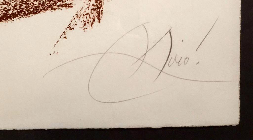
Close up of the Miro pencil signature


Close up of the Roman number, I/XV (1/15)

The application of the black overlying lines also ties the work together and further balances the work.  Imagine simply removing any element from the composition and you will realize that it becomes heavy on one side or the other.  For instance, if you remove the brown lines in the bottom right that form an angle, that part of the composition feels empty and therefore the upper and lower left sections become heavy and the work falls off balance.  This illustration can be used for just about every element, to demonstrate Miro's skill.  This particular work is very rare, as it's edition is only fifteen and this is the number one from the series.  


Photograph of the framed lithograph


Claes Oldenburg "Soft Light Bulb Day & Night," 1994


A is a matched numbered pair of Claes Oldenburg's Soft Light Bulbs Day and Night; Soft Light Bulb - Day, 1994; Lithograph with chine colle on Koller HMP Tan Canvas paper; Initialed CO in pencil bottom right and numbered 23/36 in pencil lower left; Published by Gemini G.E.L.; Framed floated on a black mat, a wood frame, and UV conservation clear glass; AND Soft Light Bulb - Night, 1994; Lithograph with chine colle on Dieu Donne Gray paper; Initialed CO in pencil bottom right and numbered 23/35 in pencil lower left; Published by Gemini G.E.L.; Framed floated on a black mat, a wood frame, and UV conservation clear glass.  Both Gemini G.E.L original print documentation documents are included.

To purchase this work or to visit the Art Gallery, CLICK HERE

Claes Oldenburg has always been interested in the characteristics of soft and hard in relation to various objects.  From MOMA in regards to the Oldenburg work, "Giant Soft Fan, 1966-67:"

"Here Oldenburg has rendered a hard object in a soft material so that it sags and droops, and he has greatly inflated its size. There is humor in this transformation of a hard machine into a collapsible object, and the result has a bodily and sexual connotation. There is also a subtle nostalgia: in its focus on the culture of its time, Pop art seemed jarringly up-to-date in the 1960s, but this fan’s design was old-fashioned even then."

With these works, "Soft Light Bulb Day & Night," the similarities with the "Giant Soft Fan" are apparent.  The choice of subject matter is consistent, a light bulb with a simple turn dial on/off switch that is attached to a sagging uncovered electrical wire.  The light bulb itself is soft and flattens on it's end as it rests on a hard surface.  These two works are being sold as pair (the above image in a concatenated image of the two separate works) and the genius of Oldenburg can be seen when viewing them together.


Photograph of the framed "Soft Light Bulb Day"

With "Soft Light Bulb Day" the choice of paper is very specific, as it is a very light color, suggesting a daylight time of day.  The black outlines of the wire, bulb, and surface are very apparent.  What is not that noticeable is the white collage element with the black X; which represents the light from the electrified internal filament.  In the "Day" version, either the power is not on or the light does not appear that bright because of the daylight conditions.

"Soft Light Bulb Night" is the opposite with all the black line elements much less observed on a grey-black paper; which symbolizes night time.  However, the white collaged element marked with an X (with the electrical power on) now glows bright!  The set of works are quite wonderful and are created in a very low edition size.  The "Day" version is an edition of 36 and "Night" is in an edition of only 35; however this set is match numbered (23) with "Day" numbered 23/36 and "Night" numbered 23/35.  Because the edition size is so small, this may be the only matched pair on the open market.


Photograph of the framed "Soft Light Bulb Night"

Andy Warhol - Double-sided Watercolor


A Gold Book: Double Sided Two Plates; 1957; Offset lithographs with hand-coloring, on wove paper, a trial proof, presumably unique in this composition, the full sheet, printed on both sides of one sheet; Authenticated by the Andy Warhol Art Authentication Board and numbered PM20.0230; Framed with two linen acid free mats, two gold wood fillets, a hand carved and gilded wood frame, and UV conservation clear glass.

To purchase this work or to visit the Art Gallery, CLICK HERE

In the 1950's Andy Warhol was a very successful and very sought after commercial artist working in New York.  He had gained notariety for his blot line technique, which produced an elegant incomplete (dotted and dashed) line that he was using in various print advertising and commercial applications.  The dotted/dashed lines of his compositions were then hightened with watercolors and the resulting works had made Warhol one of the most used commercial illustrators in New York.

The blot line was accomplished by Warhol first drawing out his image on a sheet of paper and then placing wax paper over the image.  He would then use an ink fountain pen and trace over his original drawing.  While the ink was still wet on the wax paper, a new sheet of white paper was blotted onto the wax sheet containing the ink drawing.  The result was a mirror image of the original drawing, with the ink lines composed of broken dots and dashes.  These blotted drawings had a wonderful feel to them, their lines were soft and quite unique!


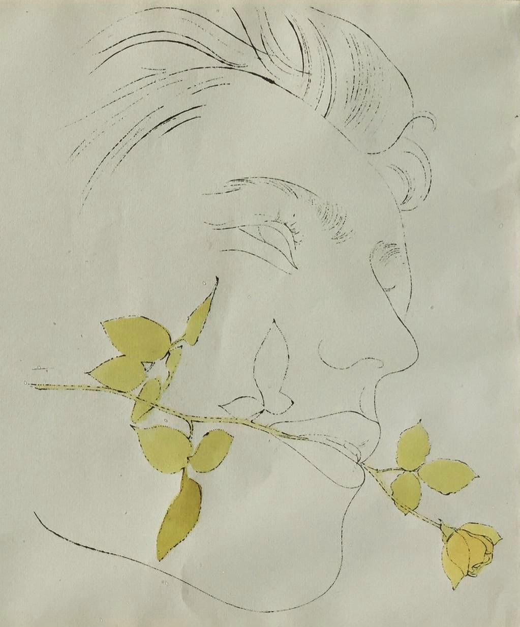
Close-up of the man with a yellow rose.


Full sheet


Framed image.

This work for sale is a really spectacular example of Andy Warhol's blot line technique that was translated into lithograph.  Warhol had gained in popularity due to his large commercial campaigns and decided to compete a series of limited edition lithographs that were then hand watercolored.  These works were sold and many were given away as gifts.  Presented here is a rare double sided work with two of Warhol's most famous images; the male head profile with a single yellow rose between his lips and on the verso, a red bird resting on a a fruiting tree branch.  In both cases all the black lines were initially created with his blot line technique and then translated into lithographs.  These were then hand watercolored, so that the yellow rose, it's green leaves and stem, as well as the red bird were all hand painted using Warhol's preferred brand of watercolor, Dr. Martin's Watercolors.


Close-up of red bird on a fruiting branch - verso


Full sheet - verso


Framed image - verso

The frame is created specifically for this work.  It was hand carved and created in a way that allows for both sides of the work to be seen without the art having to be removed from the frame.  The front side of the drawing is the male profile with a yellow rose between his lips.  This side of the frame has a pale green linen mat, UV conservation clear glass, and a gold fillet.  The wood frame is hand carved with matching gold gilded roses in each of the four corners, flanked on both sides by a hand carved leaf.  The red bird side of the work has a bright red linen mat, UV conservation clear glass, and the same gold fillet as it's verso.


Detail of the hand carved and guilded rose corner of the frame.

Saturday, December 20, 2014

Kenneth Noland "Twin Planes," 1969


Twin Planes, 1969; Signed, dated, and numbered '193/200 K. Noland 5/5/69' in ink (on the reverse support); Serigraph on canvas laminated to board; Published by Sarah Lawrence Art Press and Chiron Press, New York, with their inkstamps on the reverse.  Framed using a light white washed wood frame and a linen canvas liner; Image 6¼ x 58¾", Frame 9 1/4 x 61 3/4"


The famous art critic Professor Meyer Shapiro made a distinction between the objects in a painting and the subject matter.  This allows for an understanding that just because a painting does not have recognizable figurative objects, it does not necessarily follow that there is no subject matter.  Shapiro's statement can be applied to the abstract artist Kenneth Noland.  Noland was part of an art movement, dubbed by the art critic Clement Greenberg in 1964, as post-painterly abstraction.  Over time other terms and categories emerged, and he along with his contemporaries (Gene Davis, Friedel Dzubas, Sam Francis, Helen Frankenthaler, Ellsworth Kelly, Morris Louis, Jules Olitski, Frank Stella, etc.) were further grouped by art critics and museum curators into minimalism, hard-edge painting, lyrical abstraction, and color field painting.


Detail of "Twin Planes," 1969

This work, "Twin Planes" from 1969, is a wonderful example of Noland at his best!  Kenneth Noland worked in series, meaning that the structure that was used to compose his color paintings was relegated to a defined format.  The first format to emerge in the late 1950's were the circle paintings followed in the early 1960's by the chevrons.  This work is from the strip series, which started mid to late 1960's.  Although lacking the traditional objects of a landscape, this work has landscape as it's subject matter.  The width and color of the horizontal stripes implies the green foreground with the alternating pink and unpainted canvas as a horizon line.  The sky and clouds read as pale blue mixed with the lazy white clouds and rays of yellow-orange sunlight shining through.  There are a total of nineteen horizontal lines making up the composition, made up of both painted stripes and unpainted canvas.  The experience and feeling of a landscape is conveyed with simple lines, without the classical features of easel painting.


Edition number, signature, date, and publisher on verso.

Friday, December 19, 2014

Roy Lichtenstein "1985/1990 Champagne Taittinger Brut Bottle"


1985/1990 Champagne Taittinger Brut Bottle (Empty) with hang tag and box; Serigraph in white, light green, silver, yellow, green, and black on blue form encasing the glass bottle and in part on the side and top of yellow box that contains the bottle 1985/1990; Signed rf Lichtenstein in white, in the plate, lower bottom edge of bottle; Signed rf Lichtenstein in blue, in the plate, lower right on the top of the box and signed rf Lichtenstein in white, in the plate inside the lid of the box.


The BMW Art Car Project was introduced by the French racecar driver and auctioneer Herve Poulain, who wanted to invite an artist to create a canvas on an automobile.  In 1975 the American artist Alexander Calder was the first artist selected and he painted a BMW 3.0 CSL; which Poulain himself raced at the Le Mans endurance race of the same year.  Other artists also painted BMWs including David Hockney, Jenny Holzer, Robert Rauschenberg, Frank Stella, Andy Warhol, and Roy Lichtenstein.  There is a history of artists working on commercial projects and in other media outside of their known repertoire, such as paintings on canvas or traditional sculpture.


Photograph of the front of the bottle showing the hang tag and the signature along the bottom edge.


Photograph of the back of the bottle.

The Taittinger Company had a history of commissioning artists to design bottles for it's collection and some of the artists chosen include: Victor Vasarely, Arman, Andre Masson, and Marie-Elena Vieira da Silva.  Lichtenstein's bottle was the fifth design in the Taittinger Collection series.  He was approached about doing the design in 1986, and the bottle was introduced on October 16, 1990, in Paris, France.  In the US, the Lichtenstein bottle was presented at the Whitney Museum of American Art, New York, on June 10, 1991.  The image that Lichtenstein created is a wonderful (Ben-Day dot with flat color shading) abstracted head profile with flowing hair.  There are grapes, grape leaves, and vines scattered throughout the bottle as well as champagne bubbles.  The entire work is accomplished in a brilliant cobalt blue with white, yellow, pale blue, and silver making up the various elements.  Each individual form is highlighted with black outlines, so that the colors are separated and therefore more intense.  This image is also reproduced, in part, on the side and top of the yellow presentation box that contains the bottle.  Lichtenstein's signature is reproduced on the bottle, the top of the box, and again inside the box lid.  The box was printed in France by Quadra Creations.  The edition is 100,000 vintage 1985 Tattinger bottles from Reims, France.  The measurements are: Bottle: 3 3/4" x 3 3/4" x 13 1/2"; Box: 4 1/8" x 4" x 14".


Photograph of the open box showing the signature on the inside lid cover.

Pablo Picasso - "Tete De Bouffon or Carnaval (Head of a Jester or Carnival)," 1965


Tete De Bouffon or Carnaval (Head of a Jester or Carnival); Linocut in black and brown, 1965, on Arches, signed in pencil, numbered 66/160; framed; Size - Image: 25 1/8" x 20 5/8", Sheet: 29 3/8" x 24¼", Frame 50 x 43 1/2"; Framed with two linen mats, a black wood fillet, a black and brown wood frame, and UV conservation clear glass; Catalog Raisonne: B. 1193, Ba. 1356, L-182.


Pablo Picasso was a master of technique and no matter what materials he worked, he excelled!  His print techniques were no exception; lithography, drypoint, etching, aquatint, and engraving were all masterfully executed.  However, it was with the linocut that Picasso was able to not only master, but also be able to move the technique giant steps forward.

The linocut is a very early technique that was created during the early part of the 20th century and is a form of printmaking that uses a block of wood or a sheet of linoleum, as a relief surface.  The artist will cut into the linoleum surface with a sharp knife or chisel, with the raised (un-carved) areas representing a reversal (mirror image) of the parts to be printed.  The linoleum sheet is inked with a roller and then impressed onto paper.  The actual printing can be done by hand but is usually accomplished with a press.  The technique is straightforward and if multiple color prints are wanted; separate linoleum blocks are carved, sequentially inked, and printed.  


Close up of the Picasso pencil signature.

Picasso used the multiple block technique to create linocuts composed of several different colors however; due to the imperfect registration of the blocks during printing, the colored areas would not completely register.  Picasso, out of frustration over poorly registered multi-block prints, came up with the idea of the "reductive" linocut.   After each successive colour is imprinted onto the paper, Picasso would then clean the linoleum block and then cut away what will not be imprinted for the subsequently applied color, and so forth and so on.  This allowed for a perfect registration of each inked color and complete control of all carved forms.  The technical skill of understanding the reversal imagery, color placement, and comprehension of the sequence of forms that were carved is quite extraordinary; and further proves that Picasso was a master artist!

In collecting Picasso original prints, it is important to note that the vast majority of works are black and white.  Colored works will be a few stone lithographs and the linoleum cuts, where black, brown, and the white or cream paper make up the color spectrum for the majority of the works.  In this work, "Tete De Bouffon or Carnaval (Head of a Jester or Carnival)" from 1965; the work is printed on a cream colored Arches wove paper in two colors; black on brown from one block using the reductive linocut technique.

The Jester or Harlequin as subject matter had a very long history with Picasso starting with the paintings from 1901-1910 when the characters began to appear frequently.  From the Art Institute of Chicago's web site:

"The artist certainly saw Paul Cézanne's Mardi Gras (Pierrot and Harlequin) at the 1904 Salon d'Automne in Paris, when he became most interested in the theme. The fluidity with which Picasso moved between the themes of jesters, Harlequins, and saltimbanques—the itinerant acrobats who sometimes dressed in the costumes of Commedia dell'Arte characters—shows how personally he identified with these performers to channel themes of alienation, love, jealousy, and fraternity."

The Jester was part of Pablo Picasso's lexicon throughout his life and would reemerge over and over again in different forms and in all mediums; including prints, paintings, sculpture, and ceramics.


Thursday, December 18, 2014

Arman - "The Bow On The Strings Frees An Explosion Of Sounds," 1987


The Bow On The Strings Frees An Explosion Of Sounds, 1987; Serigraph on Rives vellum paper; Signed Arman in pencil lower right and numbered 50/200 in pencil lower left; Published by GKM Editions, Sweden with stamp lower left; Framed with an acid free linen liner, a silver and black wood frame, and UV conservation clear glass.

To purchase this work or to visit the Art Gallery, CLICK HERE

New Realism was an art movement that started in France in 1960 with Pierre Restany writing it's original manifesto which proclaimed: "Nouveau Realisme -new ways of perceiving the real."  This group of artists was interested in new ways in which to create art, and in the process subvert the status quo.  The artist Arman was one of the original founding members and he was known for his "accumulations" and for his destruction/recomposition of ordinary objects.  Arman featured objects with a strong "identity" such as musical instruments, with the violin being his most famous subject matter; and in this work the violin and bow are repeated in yellow, blue, and black onto a single sheet of paper.  This accumulation of the violin allows for the image to no longer be isolated but rather repeated, in order to create an effect of a balanced abstraction composed of multiple arrangements of a violin and it's bow.  Arman has titled this work, "The Bow On The Strings Frees An Explosion Of Sounds," which further enhances the concept of multiple images in order to create not just a single tone, but rather an "explosion of sounds!"


Framed Arman - "The Bow On The Strings Frees An Explosion Of Sounds"

Friday, December 12, 2014

James Rosenquist - "Cold Rolled, 1974-1976"


Cold Rolled,1974-76; Lithograph in colors with string and stone, on Arches Cover paper; Signed 'James Rosenquist' and dated 1974-76 lower right, titled 'Cold Rolled' in pencil lower center left; and numbered 5/60 in pencil lower left; Published by S. Singer, New York; Framed using a linen liner, a black wood frame, and UV plexiglass.


The American artist James Rosenquist earned his living as a billboard painter from 1957-1960 and this is often sited as one of the artist's inspirations, as his former job relates to scale and size of some of his most famous works.  Although Rosenquist is usually grouped in with the Pop Artists, he does not like this classification.  He has said, "They [art critics] called me a Pop artist because I used recognizable imagery.  The critics like to group people together.  I didn't meet Andy Warhol until 1964.  I did not really know Andy or Roy Lichtenstein that well. We all emerged separately."  


Signature and date for "Cold Rolled"

Rosenquist is known for taking fragmented and odd images and then combining, overlapping, and/or placing them in unusual orientations in order to create a visual story line.  In many cases the original derivation of the image can not be determined, so that the viewer is left seeing familiar features of an object but not completely able to determine what the object was originally.  It is this ability, to organize and then synthesize into new compositions, that has made Rosenquist one of the greatest artists working today.


Top of the string going through a hole at the top of the sheet.


Bottom of the string showing a close-up of the rock tied to the end.

"Cold Rolled, 1974-1976" is a large format print by James Rosenquist showcasing some of his most famous imagery that he developed through the years.  The most prominent feature of the work is the large paperclip which spans the sheet on a slight diagonal; which immediately puts the viewer off balance.  The left side of the sheet is dominated by the mottled blue color with the white outline of beam of light being bent as it passes through a triangular prism.  The center white area has the collaged elements of a string with rock attached, and the rock rests near the nexus of the series of varying light values of primary colored lines expanding upward.  The right side of the print is composed of a red mottled area with fragmented sections of a penny, as well as a series of different colored horizontal tire tracks.  The totality of the work reorganizes all these objects and fragments into a truly beautiful and complex work that can be enjoyed both close up and far away.  The addition of the collaged string and rock increases the visual interest and adds an additional layer of balance.


Framed image of "Cold Rolled"