Translate

Friday, September 25, 2020

Cerulean Blue Macchia with Violet Lip Wrap, 1986 by Dale Chihuly


Monumental Cerulean Blue Macchia with Violet Lip Wrap, 1986; Free blown, flared form with undulating rim, dappled with pink, white, and yellow with a cerulean blue interior and violet lip wrap; Engraved Dale Chihuly 1986 bottom; Size: 32" x 22" x 11".


"My work, to this day revolves around a simple set of circumstances: fire, molten glass, human breath, spontaneity, centrifugal force, gravity." - Dale Chihuly

Dale Chihuly was born on September 20, 1941 and is an American glass sculptor. His works are considered to be exceptional in the field of blown glass; and he has adapted the technical difficulties of the medium to explore and implement installations, as well as environment specific artwork.

Chihuly first began experimenting with glass blowing in 1965 and began an extensive education centered around sculpture. He earned a Master of Fine Arts degree in sculpture from the Rhode Island School of Design in 1968; and that same year was awarded a Louis Comfort Tiffany Foundation grant for his work in glass, as well as a Fulbright Fellowship. He traveled to Venice to work at the Venini factory on the island of Murano, where he first saw the team approach to glass blowing. In 1976, while in England, he was involved in a head-on-car crash which propelled him through the windshield. His face was severely cut by glass and he was permanently blinded in his left eye. After recovering, he continued to blow glass until he dislocated his right shoulder in 1979 while body surfing.

No longer able to hold a glassblowing pipe, he was able to utilize the team approach to glass blowing he had seen in Murano, and hired other artists to do the physical work. Chihuly explained the change saying, "Once I stepped back, I liked the view." He felt liberated and more free to see the work from multiple perspectives, and the change enabled him to anticipate problems earlier and to react. His role in the studio changed from participate, to supervisor and problem solver. One of the most critically acclaimed series by Chihuly was the Macchia series. Macchia, which is Italian for spot, was begun in 1981 and continues today.
 
As Chihuly has explained:
"The Macchia series began with my waking up one day wanting to use all three hundred of the colors in the hot shop. I started by making up a color chart with one color for the interior, another color for the exterior, and contrasting color for the lip wrap, along with various jimmies and dusts of pigment between the layers of glass. Throughout the blowing process, colors were added, layer upon layer. Each piece was another experiment. When we unloaded the ovens in the morning, there was the rush of seeing something I had never seen before. Like much of my work, the series inspired itself. The unbelievable combination of color - that was the driving force."

From Timothy Anglin Burgard, Chihuly the Artist: Breathing Live into Glass, 2008:
 (The Macchia) Often balanced slightly off-center, they attempt to capture the essence of glass in its most volatile sate - simultaneously hot and flowing, but also cool and congealing. The blurred edges of the color striations and "spots" suggest that they are being dissolved by heat or have coalesced into opal-like mineral deposits. Chihuly's "lip wraps," think ribbons of colored glass that run along the vessel's lip suggest the presence of a super-heated inner core and recall the leading edge of a lava flow, breaking through the congealing perimeter of a magma mass. - Chihuly's Macchia are permanently aglow with the fires of their creation."
 
 
The following are various views of Cerulean Blue Macchia with Violet Lip Wrap, 1986 by Dale Chihuly:


From Robert Hobbs, The Rhoda Thalhimer Endowed Professor of American Art History, Virgina Commonwealth University: 
"In the Macchia, Chihuly makes this former (Classic Venetian blown glass) static orientation dynamic and enlarges this conservative scale to awesome proportions. He heightens tensions between inside and outside through dissonant color combinations and through contrasts of opacity, translucency, and transparency. Rather than continuing the preciousness of the filigree of the Bianconi examples, he creates a bolder impact by rolling ships of colored glass into the walls of the vessel for a mottled effect."

Chihuly and his team of artists have been the subjects of several documentaries, extensive printed articles, monographs, and collections. For a complete list of Museum collections, please click on the link below:


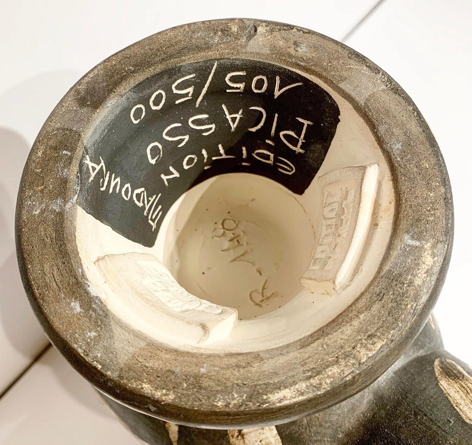
Engraved Dale Chihuly signature and 1986 date, bottom.

"Cerulean Blue Macchia with Violet Lip Wrap," 1986 is an exceptional example of Dale Chihuly at his best. This monumental Macchia is composed of cerulean blue as the dominant interior color, pink and yellow spots set against a white ground on the outside, and finished with a contrasting violet colored lip. An absolutely stunning and massive piece of modern glass by the most important glass artist of his time, and a standout of any art collection!

Wednesday, March 18, 2020

Diamond Dust Candy Box, 1981 by Andy Warhol


Diamond Dust Candy Box, 1981; Synthetic polymer paint, diamond dust, and silkscreen ink on canvas; Stamped with the Estate of Andy Warhol and the Andy Warhol Foundation for the Visual Arts stamps; Numbered VF PA13.005 on the overlap; Numbered twice 'PA13.005' on the stretcher; Size - Canvas: 14 x 10", Frame 17 x 13 1/4"; Framed using a black wood frame and plexiglass.


"You take some chocolate... and you take two pieces of bread... and you put the candy in the middle and you make a sandwich of it. And that would be cake." - Andy Warhol

Andy Warhol loved chocolate and many days, at lunchtime, he would go the Upper East side restaurant "Serendipity" for it's speciality; a glass of frozen hot chocolate. He also had an insatiable sweet tooth, he said "When I was a child I never had a fantasy about having a maid, what I had a fantasy about having was candy. As I matured that fantasy translated itself into 'make money to have candy,' because as you get older, of course, you get more realistic." In the 1980's Warhol would seize on his love of chocolate candy to create a series of paintings and prints that had as their subject matter open and closed chocolate boxes.


Close up of the Estate of Andy Warhol and the Andy Warhol Foundation for the Visual Arts stamps; and the unique authentication number VF PA13.005 on the overlap.


Close up of the unique authentication number VF PA13.005 inscribed twice on the stretcher.

Andy Warhol's paintings of candy boxes was a refreshing return to his 1960's consumerism as well as nod to his love of chocolate. The artworks that were created were used as holiday and personal gifts to friends and associates. Some of the paintings show a beautifully wrapped heart shaped chocolate box (invented by the English chocolatier Richard Cadbury), while this example showcases the chocolate candy contained within a rectangular box. Unlike the paintings of just the boxes, some of the paintings of the chocolates themselves are also diamond dusted. The glittering diamond dust adds to the delectable, delicious, and decadent appeal of the chocolate bon bons.

Warhol's use of diamond dust is owed to his friend John Reinhold; who was a diamond dealer and art collector. One day John gave Warhol a jar of diamond dust, suggesting he could incorporate it into his artwork; which lead to the Diamond Dust series for both prints and paintings. John Reinhold's wife Susan co-founded the Reinhold-Brown Gallery, and Warhol painted portraits of John Reinhold and his and Susan's ten year old daughter Berkeley. In 1981 Warhol gave Berkeley an 80 page leather-bound diary. On each page was drawn abstract forms that slowly progress and develop page-by-page into a beautiful dollar sign. In 2010 Rizzoli published a reproduction of the diary in book form entitled "Andy Warhol: Making Money.


Framed "Diamond Dust Candy Box," 1981 by Andy Warhol 
 

Back of framed "Diamond Dust Candy Box," 1981 by Andy Warhol 

"Diamond Dusted Chocolate Box" is an exceptional example of Pop Artist Andy Warhol as his best. The image of an open box of glittering chocolate candies is instantly recognized and immediately causes the viewer's mouth to water. The inconsistent screen printing of the chocolates likens back to Warhol's rough screening of the Campbell's Soup Cans and Marylin Monroe paintings of the 1960's. This is an absolutely fantastic unique work on canvas by the great Pop artist Andy Warhol and would be a standout of any art collection!


Video of the surface of "Diamond Dust Candy Box" 1981 by Andy Warhol

Sunday, October 20, 2019

Chouette (Wood Owl) Ceramic Vase by Pablo PIcasso, 1969


Chouette (Wood Owl) Vase, 1969; Partially glazed white earthenware vase painted in colors; Numbered 105/500; Inscribed 'EDITION PICASSO' and 'R-148 MADOURA', with the 'MADOURA PLEIN FEU' and the 'EDITION PICASSO' pottery stamps on the underside; Size - Wood Owl Vase: 11 3/4" x 5 1/2" x 8 1/2"; Catalogue Raisonne: A.R. 605.


During the late 1940s, Pablo Picasso spent the summers on the Cote d'Azur in the South of France. There the artist visited Vallauris for the annual pottery exhibition in 1946. He was impressed by the quality of the Madoura works and was introduced to the owners, Suzanne and Georges Ramié. The Ramiés welcomed the famous artist into their workshop and gave him access to all the tools and resources the he needed in order to work in the medium of ceramics. In exchange, the Ramié family would produce and sell his limited edition ceramic works and this relationship spanned 25 years. It was also at the Madoura factory in 1953 that Picasso met Jacqueline Roque, who would become his second wife in 1961.


Side view of the Chouette (Wood Owl) Vase by Pablo Picasso


Back view of the Chouette (Wood Owl) Vase by Pablo Picasso


Front view of the Chouette (Wood Owl) Vase by Pablo Picasso

The Market for Picasso ceramics has been steadily rising as outlined by a recent article:
"Over the past 10 years, the market for Picasso ceramics has steadily grown, with seasoned collectors and new buyers alike vying for Picasso's editioned and unique ceramics at auction. This market is stable, with a steady high sell-through rate around 89% (87% in 2004, 89% in 2005, 87% in 2011, and 90% in 2012), and prices that are still lower than the rest of Picasso's work. The broad range of estimates and sales prices help make this market attractive to many collectors, but also explain the high average sales prices, which are skewed by a few exceptional pieces. In the previous two years, more than 60 exceptional ceramic works sold for over US$100,000: 34 in 2011 and 29 in 2012 (vs. six in 2004 and 2005)." - The Story Behind Picasso Ceramics, by Fanny Lakoubay and Conner Williams, 2013


Inscribed 'EDITION PICASSO' and 'R-148 MADOURA', with the 'MADOURA PLEIN FEU' and the 'EDITION PICASSO' pottery stamps on the underside


Inscribed 'EDITION PICASSO' and 'R-148 MADOURA', with the 'MADOURA PLEIN FEU' and the 'EDITION PICASSO' pottery stamps on the underside

The famed artist Georges Bloch stated of Picasso’s ceramic works:
 "…in approach, material and technique is as novel as it is interesting. Pottery, gleaming white discs with relief designs, monochrome or brightly coloured ovals, dishes and even jugs and vases here serve as bearers of compositions whose themes express the joyous, life-loving side of Picasso’s work. They are printed from blocks and stamps fashioned by the master over a period of more than twenty years in the Madoura pottery workshop in Vallauris.”

From Charles Mathes's site valuethoughts.com:
"In 1946 Picasso was staying near Antibes in the South of France and decorating the walls of what would become the Musée Picasso. A small owl with an injured claw that had been found in a corner ended up living with him and his lover, Francois Gilot. According to Gilot in her book “Life With Picasso” the owl was an ill-tempered creature who smelled awful and ate only mice. The owl would snort at Picasso and bite his fingers; Picasso would reply with a string of obscenities just to show the bird who was the most ill-tempered. Clearly bad manners were the way to Picasso’s heart for not only did he do a number of paintings, drawings and prints of owls, he created numerous ceramics."

Picasso would use the owl in paintings, prints, drawings, sculptures, and ceramics for the rest of his life. After Picasso's death, drawings were found that illustrate that the form used for the owl ceramics had been made during the time in 1946 when the wood owl first appeared in Picasso's atelier. This is a wonderful owl vase ceramic created in 1969, and the painting of the vessel is beautifully rendered in natural browns, black, and cream colors. The brushstrokes are consistent with free form feathers making up the wings, head, and feet. This is a spectacular piece of original Picasso artwork and a great addition for any art collection!

Saturday, October 12, 2019

Self-Defense (Positive), circa 1985-1986 by Andy Warhol


Self-Defense (Positive), circa 1985-1986; Acrylic and silkscreen ink on canvas; Stamped three times with the Estate of Andy Warhol stamp; Stamped twice with the Andy Warhol Foundation for the Visual Arts stamp; Numbered twice 'PA10.432 VF' on the overlap; Numbered 'PA10.432 VF' on the stretcher; Size - Canvas: 20 x 16", Frame 22 x 18"; Framed using a black wood frame and plexiglass.


"My fascination with letting images repeat and repeat - or in film's case 'run on' - manifests my belief that we spend much of our lives seeing without observing." - Andy Warhol 

In the 1980's Andy Warhol began a series of primarily black and white ad paintings whose source material was derived from advertisements, maps, diagrams, and illustrations found in newspapers and magazines. For Warhol, this was a return to lowbrow print subject matter that he had utilized in the 1960's and at the same time served as artistic commentary on American consumer culture. He kept to a monochromatic palette of black and white, thereby retaining the origin and style of the original advertisements.


"Self-Defense (Positive)" verso


Close up of the Estate of Andy Warhol stamps, Andy Warhol Foundation for the Visual Arts stamp, and 'PA10.432 VF' number verso on the overlap.


Close up of the Estate of Andy Warhol stamp, Andy Warhol Foundation for the Visual Arts stamp, and 'PA10.432 VF' number verso on the overlap..

"Self-Defense" was originally adapted from a black and white advertisement which read: "SELF-DEFENSE - SECRETS REVEALED - PROTECT YOURSELF AND FAMILY FROM MUGGING - RAPE - ROBBERY - HOODLUMS - WIN ANY FIGHT WITH EASY TO LEARN SURVIVAL TECHNIQUES - FOR MEN AND WOMEN OF ALL AGES!" Warhol kept the bold graphic text but deleted both letters and words that allowed for a very balanced and well composed image. The all capital lettering played against an illustrative taller male figure with his hands grasped around a shorter woman's neck. The block text is declarative in it's stark black and white, laid bare on the canvas with only minor black shading; which allows the viewer to focus on the explicit visual language of the artist. The mechanical printed text with the surrounded brushstrokes allows for a blend between man and machine; thereby subverting the distinction between painting and photographic reproduction. The meaning of the text that remains; declares that through this self-defense training class, secrets will be revealed that will allow the student to protect his/her self from a wide range of harm. Warhol, throughout his artistic career, was a master of satirizing commercialization. He also was interested in mass conformation noting "I'm for mechanical art. When I took up silk screening, it was to more fully exploit the preconceived image through the commercial techniques of multiple reproduction."


Original advertisement source material for "Self-Defense (Positive)" by Andy Warhol


Framed "Self-Defense (Positive)" circa 1985-1986 by Andy Warhol

This is an absolutely fantastic unique work on canvas by the great Pop artist Andy Warhol and would be a great addition to any art collection!

Monday, March 18, 2019

Be A Somebody With A Body, 1985 by Andy Warhol


Be A Somebody With A Body, 1985; Acrylic and silkscreen ink on canvas; Dedicated, dated, and signed 'JOHN 85 Andy Warhol' verso on the overlap; Stamped with the Andy Warhol Art Authentication Board, Inc., stamp and numbered 'A122.0911' on the overlap; Size - Canvas: 8" x 10", Frame 14 3/4" x 18 3/4"; Framed using a black wood frame.

To purchase this work or to visit the Art Gallery, CLICK HERE!

"Muscles are great. Everybody should have at least one they can show off." - Andy Warhol 

In the 1970's Andy Warhol was aware of new trend emerging, as he said "So many people have such great bodies today that the sort of lumpy sit around the house flab that used to be normal now looks really bad. You can't go anyplace in America without seeing boys and girls and men and women who look like they have been professional athletes their entire lives." The 1976 symposium at the Whitney Museum entitled "Articulate Muscle: The Male Body in Art" was a presentation of three Mr. Universe types Frank Zane, Ed Corney, and Arnold Schwarzenegger. The event was inspired by Charles Gaines, who's popular book "Pumping Iron" was the first serious book written about body building. Gaines helped to persuade the Whitey that the muscular bodies should be seen, not in athletic terms, but rather as living works of artistic creation. Schwarzenegger knew Warhol and stated "I became very good friends with Andy Warhol and used to hang out at the Studio in the seventies because he was a big believer in bodybuilding (and like other hip celebrities) helped get bodybuilding out of the dungeon to make it a hip activity to do." The Whitney show would have certainly been of interest to Warhol who had always been interested in transformation as depicted in his early painting "Before and After." The painting was based on a small advertisement for a plastic surgeon that ran in the National Enquirer in early 1961, and depicts a woman's nose before and after a nose job. The 1980's saw in increase in both gym membership and body building; as being seen as a way to achieve morphological perfection. At the same time Arnold Schwarzenegger had become a major Hollywood star, and Warhol would have realized Schwarzenegger had become somebody with a body!


"Be A Somebody With A Body" verso


Close up of the dedication, date, and Andy Warhol signature verso on the overlap.


Close up of the Andy Warhol Art Authentication Board Inc. stamp and the unique authentication number.

In the 1980's Andy Warhol began a series of primarily black and white ad paintings whose source material was derived from advertisements, maps, diagrams, and illustrations found in newspapers and magazines. For Warhol, this was a return to lowbrow print subject matter that he had utilized in the 1960's and at the same time served as artistic commentary on American consumer culture. He kept to a monochromatic palette of black and white, thereby retaining the origin and style of the original advertisements.

"Be A Somebody With A Body" was originally adapted from an ad placed in a muscle magazine. Warhol kept the bold graphic text but added thick and fluid brushstrokes. The lettering played against an illustrative confident muscle figure that seems both accessible and yet most likely an improbable realization. The block text is declarative in it's stark black and white, laid bare on the canvas, and allows the viewer to focus on the explicit visual language of the artist. The mechanical printed text with the surrounded brushstrokes allows for a blend between man and machine; thereby subverting the distinction between painting and photographic reproduction. The meaning of the text is an explicit pressure to conform, from a nobody to a somebody, simply by attaining a muscular bodybuilder physique. Warhol, throughout his artistic career, was a master of satirizing commercialization. He also was interested in mass conformation noting "What's great about this country is that America started the tradition where the richest consumers buy essentially the same things as the poorest. You can be watching TV and see Coca-Cola, and you can know that the President drinks Coke, Liz Taylor drinks Coke, and just think, you can drink Coke too."

This particular painting was dedicated to John Reinhold who was a diamond dealer, art collector and a friend of Andy Warhol. One day John gave Warhol a jar of diamond dust, suggesting he could incorporate it into his artwork; which lead to the Diamond Dust series for both prints and paintings. John Reinhold's wife Susan co-founded the Reinhold-Brown Gallery, and Warhol painted portraits of John Reinhold and his and Susan's ten year old daughter Berkeley. In 1981 Warhol gave Berkeley an 80 page leather-bound diary. On each page was drawn abstract forms that slowly progress and develop page-by-page into a beautiful dollar sign. In 2010 Rizzoli published a reproduction of the diary in book form entitled "Andy Warhol: Making Money."


Framed "Be A Somebody With A Body," 1985 by Andy Warhol

With this image of "Be A Somebody With A Body," Warhol created a Reversal of his initial composition by having the black and white tones switched. He had previously employed this technique with some of one of his most famous works, including his iconic portrait of Marylin Monroe. For this painting the resulting image appears as if the spectator were looking at a photographic negative. The highlighted face, body, and text have gone dark; and former shadows and highlights now rush forward in bold stark forms. The resulting effect is powerful and is able to further activate the painting at a higher level. This is an absolutely fantastic unique work on canvas by the great Pop artist Andy Warhol and would be a great addition to any art collection!

Wednesday, February 13, 2019

Torso (Double), circa 1982 by Andy Warhol


Torso (Double), circa 1982; Screenprint in colors on Saunders Waterford (Hot Pressed) paper; Andy Warhol Art Authentication Board Inc. stamp, The Estate of Andy Warhol stamp, and inscribed with unique authentication number in pencil on the reverse; Printer: Rupert Jasen Smith, NY; Size - Sheet 30 1/2" x 43"; Catalog Raisonne: Feldman/Schellmann: IIIA.35 [c]; Unframed.

To purchase this work or to visit the Art Gallery, CLICK HERE!

"We live in an age when the traditional great subjects - the human form, the landscape, even newer traditions such as abstract expressionism - are daily devalued by commercial art." - Andy Warhol 

In the late 1970's, Andy Warhol began to work on two complementary series of works, Sex Parts and Torsos. Both series were derived from erotic photographs taken by the artist with his 35mm and Polaroid Big Shot cameras. When Warhol was once asked about the nude photographs scattered around his studio, he said to associate Bob Colacello "Just tell them it's art, Bob. They're landscapes." The Torso series developed after Warhol discovered a box of explicit nudes he taken earlier of the porn star Ken Harrison. The less risque photographs were converted into silkscreens, and were used to create prints for the Torso series. They were first shown at the Grand Palais, Paris in October, 1977.

The Torso series would be a subject that Warhol would return to throughout his artistic life, and it is has been compared to the classical nudes and human body representations that have been depicted throughout the annals of art history. Warhol created this imagery using a variety of different media including photography, painting, film, and print making.


Close up of the Andy Warhol Art Authentication Board Inc. stamp, The Estate of Andy Warhol stamp, and the unique authentication number.

Torso (Double) is a wonderful example of Warhol's use of the human form as subject matter. This work exists only in unique print format, with no canvas paintings ever having been created. The focus is a bent male nude, with his arms in front of him, and cropped so he can only be viewed between his neck and upper thigh. The resulting composition has been doubled, with one image superimposed next to the other, and the entire field covered with bold and graphic colors. Both images are joined together not only by overlapping forms but by sharing the colors of a light pale blue and a saturated orange. The right image also has a pale green and pale purple, while the left has a dominating eye catching red. The colors, in combination with the poses, are both imposing and suggestive without being pornographic. This allows for the eyes of the viewer to skip and move about the field, all the while finding new pathways and relationships within the double lined figurative forms. Torso (Double) is an absolutely fantastic human figurative work by the great Pop artist Andy Warhol and would be a great addition to any art collection!

Wednesday, January 23, 2019

"Untitled," 2009 by Kenneth Noland


Untitled, 2009; Etching and aquatint in colors, on wove paper; Signed with initials K N lower right and numbered 42/65 in pencil bottom left; Pace Editions, Inc., New York; Size - 35 1/4 x 35", Frame 38 1/2 x 38"; Framed floated on a white mat, white wood frame, & plexiglass.

To purchase this work or to visit the Art Gallery, CLICK HERE!

"I knew what a circle could do. Both eyes focus on it. It stamps itself out, like a dot. This, in turn, causes one's vision to spread, as in a mandala in Tantric art." - Kenneth Noland

In October of 1952 Helen Frankenthaler, after a trip to Nova Scotia, had a breakthrough with a painting entitled "Mountains and Sea." The painting was abstract and rather than painting the landscape that she saw on her trip, the work portrayed the experience itself. The abstract image was painted using a "soak stain" technique, whereby unprimed canvas duct is painted using oil paint that had been heavily thinned with turpentine. The effects of the technique reinforced the abstract nature of the landscape painting; and when the artists Kenneth Noland and Morris Louis saw it in her studio in New York, their own painting styles were forever changed.

On the train ride back to Washington DC, Noland and Louis realized that Frankenthaler's painting was their key to finding their own paths. Each made the decision to disregard all his own prior work and begin fresh. Noland stated, "We were interested in Pollock but could gain no lead from him. He was too personal. But Frankenthaler showed us a way - a way to think about and use color." Morris Louis found is structure for his color field paintings first with the unfurl series; and soon after Kenneth Noland found his, with the circle paintings. "I knew what a circle could do. Both eyes focus on it. It stamps itself out, like a dot. This, in turn, causes on's vision to spread, as in a mandala in Tantric art," Kenneth Noland.


Close up of the K N initials.

The circle paintings in the 1960's were Noland's first color format; but would be followed over the years by chevrons, strips, plaids, and irregular painting series. Noland would return to these early formats in the 1990's using opaque and bold acrylics, however the soak stain technique from the 1960's are by far his greatest achievement.


Close up of the edition number.


Framed "Untitled," 2009 by Kenneth Noland.

This is an absolutely wonderful etching and aquatint by Kenneth Noland! The inner circle is a strong bold blue with outward circles of a washed light purple and a rich dark green. The ground is a soft blue which further enhances the interactions of the color fields, overall composition, and balance. To further activate the surface and create an additional circle field, a soft blue line is at the margin for the outer circle, which then fades as a soft mist into the blue ground. A stunning work by Kenneth Noland and a beautiful addition to any art collection!