Translate

Friday, March 10, 2023

Joseph (From Men in the Cities), 2000 by Robert Longo

Joseph (From Men in the Cities), 2000; Lithograph on Arches Cover Paper; Signed and dated in pencil lower right, Numbered 36/50 in pencil lower left; Published by Wolfryd-Selway Fine Art, West Hollywood; Size - Sheet 70 x 40", Frame 75 3/4 x 45 3/4"; Framed floated on white linen with a black wood exterior frame and plexiglass.


"If you're fortunate enough with your history, like withe Men in the Cities, your work becomes so absorbed in culture that the authorship of it doesn't exist anymore." - Robert Longo

Robert Longo (b. 1953) is an American artist, filmmaker, photographer, and musician. He is most known for his large-scale, hyper-realistic charcoal portraits that reference power, authority, and social unrest. In the early 1980's he earned acclaim for his “Men in the Cities” series, which feature business attire subjects posed in uncanny contortions. Since then, he has depicted scenes from the Occupy Wall Street movement, the aftermath of the Charlie Hebdo shooting in Paris, Black Lives Matter protests, and refugee migrations. A member of the loose cohort of Pictures Generation artists, who repurpose mass media images in their artwork, Longo draws inspiration from photographs and art historical reference material. He often uses a black and white or a monochromatic palette, carefully building his charcoal surfaces to create a sense of depth and contrast. He has exhibited at the Aldrich Contemporary Art Museum, the Brooklyn Museum, and the Los Angeles County Museum of Art, and his work hangs in the world's greatest art museums
 

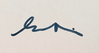
 Close up of the signature and date.

Robert Longo's "Men in the Cities" series is composed of writhing dancing figures in space. For the series, Longo photographed his friends lurching backward, collapsing forward, or sprawled on an invisible pavement. After enlarging the pictures using a projector, Longo and his assistant drew them in sizes ranging from three-quarter scale to larger than life-size. In the process, the poses were often dramatized and their attire was converted into a black-and-white business formal. The idea for this work came, in 1975, from a still image in Rainer Werner Fassbinder's film The American Soldier. According to art critic Los Angeles Times writer William Wilson, the pictures recall nothing so much as the final scene in Ingmar Bergman's The Seventh Seal. About four years passed before Longo turned the vision of a man shot in the back into a monumental series of drawings. 


Close up of the edition number.
 

 Framed Joseph (From Men in the Cities), 2000 by Robert Longo

"Joseph" is a large scale work by Robert Longo, with the sheet size being a huge seventy inches tall. The image shows a young man whose left leg has given way, as his knee buckles causing his left foot to lift and twist. Joseph's left shoulder is thrust back from his body, as is his left arm. His right shoulder and arm are in front of him and blocked by his body from the viewer. The movement is sudden and impactful, as exemplified by his black neck tie flailing in the air above him. Joseph's head is tilted back further conveying a very violent and unnatural human pose being caused by an unknown force. An absolutely stunning work by Robert Longo and a major addition to any art collection!

"You know. I think I hope I’m trying to tell the truth, and in that sense stylistically I’ve tried to avoid a style that is recognizable as a kind of like…that what Men in the Cities encapsulated. And I think that like, all these black and white drawings are basically reflective of the landscape of the world we live in. I think that my black and white drawings are… They exist somewhere between traditional representation and modernist abstraction—it’s almost like I translate photographs or something. I mean, we still see the world in photographs, in that sense. And I think black and white is actually highly abstract in that sense." - Robert Longo

#Robert Longo #Longo #Joseph #Drawing #PicturesGeneration #Realism #MenintheCities #lithograph #untitledartgallery #art #artist #modernart #figuerism #hyperrealism

Tuesday, March 7, 2023

Los Alamitos, from Race Track Series, 1972 by Frank Stella

Los Alamitos, from Race Track Series, 1972; Screenprint on Gemini Rag Board; Numbered 12/75, signed Frank Stella and dated 72 in pencil lower right; Published by Gemini G.E.L., Los Angeles, with their blindstamp and inkstamp verso; Catalog Raisonne: Axsom 74, Gemini 378; Size - Image 15 x 75 1/4", Sheet 20 1/4 x 80", Frame 20 1/2 x 80 1/2"; Framed floated with a silver metal exterior frame and plexiglass.


"I always get into arguments with people who want to retain the old values in painting - the humanistic values that they... find on the canvas. If you pin them down, they always end up asserting that there is something there besides the paint on the canvas. My painting is based on the fact that only what can be seen there is there... What you see is what you get." - Frank Stella

Frank Stella (b. 1936) is an American painter, sculptor, and printmaker, most known for his work in the areas of minimalism and post-painterly abstraction. In the late 1950's and 1960's he began to produce works which emphasized the picture-as-object, rather than the picture as a representation of the physical or emotional. The year 1959 saw the creation of the Black Paintings, a group of paintings composed of bands of black paint separated by very thin pinstripes of unpainted canvas. In 1961 he married Barbara Rose, who later be recognized as one of the most well known and respected art critics and who undoubtedly had a major influence on the artist. It was during this time that Stella continued to work within the idea that a picture was "a flat surface with paint on it, nothing more." 
 

 Close up of the edition number, signature, and date.
 
Stella generally works in series, in that the emerging works have a common theme, composition, and according to him; have the features of "line, plane, volume, and point within space." His famous quote regarding his work is, "what you see is what you see." Stella currently lives and works in New York City.

Frank Stella's race track series from 1972 consists of three horizontal prints, each named after a horse racing track in California or Mexico. Comparing horse racing to the art world he says, "Racing is so much nicer than the art world, where everything is driven by opinion. At the racetrack, it doesn't matter what people think. At the end of the race, one horse crosses the finish line first, and that horse is the best horse. It's a lot simpler." 

The concentric ellipse shaped color forms of the race track series resemble an simplified aerial view of race tracks. The first print in the series is "Del Mar," named after the racetrack in San Diego, CA. The light color values and hues are reminiscent of the the arid environment and coastal beach climate of the classic southern California way of life. "Los Alamitos," named after the racetrack in Orange County is a picture composed of shifts in color and light values. The oblong ellipses generate a pleasant and calming composition. The pale violet is surrounded by light values of blue and green and the black middle ellipse allows for the colors to pulse in a calming resonating vibrancy. The last in the series is "Agua Caliente," named for the dog racing track in Agua Caliente Casino and Resort in Mexico. The work is composed of only three ellipses and is the most bold of the grouping. An optical effect is created with a shade of green in the center surrounded by complimentary red color values. All three prints are large in size, being eighty inches long. It is this large format that allows for the works to be read as both important and to have their immediate presence further enhanced.


Close up of the Gemini G.E.L., Los Angeles blindstamp and inkstamp verso.

"I feel that what keeps the push-pull from defeating the picture, what I think keeps it on the surface, is the feeling that the colors move, they follow the bands, they have a sense of direction. It's the directional sense of color, I think that holds the surface of the painting, I wanted something that was direct - right to your eye... something you didn't have to look around - you got the whole thing right away." - Frank Stella

#FrankStella #Stella #DelMar #LosAlamitos #abstractart #abstractexpressionism #AguaCaliente #RaceTrackSeries #screenprint #serigraph #ULAE #GeminiGEL #minimalism #postpainterlyabstraction #abstraction #BarbaraRose #untitledartgallery #art #artist #modernart

Friday, February 10, 2023

Special Assortment, 2004 by Peter Anton


Special Assortment, 2004; Mixed media sculpture with resin and acrylic; Titled, “Special Assortment," dated © 2004, and signed Peter Anton in black marker verso; Size -  Box: 21 1/2 x 15 x 4 1/4".

To purchase this work or to visit the Art Gallery, CLICK HERE!

"I like to create art that can lure, charm, tease, disarm, and surprise... I have an innate reverence for the things we eat... Food brings people together and there is no better way to celebrate life... The sensual nature of the works stimulates basic human needs and desires that generate cravings and passion." 
- Peter Anton
 
Using food as subject matter is not a new idea; from the wonderfully painted 17th century food still life pictures to the POP and photorealistic artists of the 1960's, food has been front and center on the canvas. Sweets and desserts were wonderfully rendered by Wayne Thiebaud by building up the paint when making his cake paintings, in order to portray the look of real icing. Claus Oldenburg is famous for his draftsman and sculpting skills that are used to portray food as works of art. His sculptures are loose interpretations with paint splatters and spills that reinforce the hand of the artist.

With this work, Peter Anton has chosen as his subject matter the "Sweetheart Sampler," an instantly recognizable chocolate assortment contained in a heart shaped box and created as a photorealistic wall hanging sculpture. One of the most interesting aspects of his work is the size and therefore the scale to the viewer. The box is a whopping 21 1/2 x 15 x 4 1/4" and individual chocolates are about 5" each. By placing the box not on a table but on the wall, he emphasizes the idea of presentation and therefore submits the art to the viewer. This increase in size as well as the realistic interpretation, makes the viewer just want to take a bite!


Side View of "Special Assortment"

Anton's chocolate boxes are known for having a bitten cherry cordial and an empty paper wrapper. These two features further conveys to the viewer that this box is for eating and not just for looking. This box also contains the green foil covered chocolate, the milk chocolate almond topped square, the milk truffle topped with lemon curd and the orange swirl. Details such as powder sugar hanging onto the sides of the box, the gooey cherry cordial center oozing out of the half eaten piece, and the squished in and tasted blue cream truffle on the left; just makes our mouth water!

Saturday, January 29, 2022

The Soap at Baton Rouge, 1990 by Claes Oldenburg


The Soap at Baton Rouge, 1990; Cast polyurethane soap inscribed with initials, titled, and numbered 40/250 set on vinyl filled with aluminum silicon support with serigraph on acetate cover; Also includes deluxe edition of Claes Oldenburg: Multiples in Retrospect 1964-1990, Signed Oldenburg in pencil and numbered 40/250; Contained in cloth covered portfolio box; Published Carl Solway Gallery, Cincinnati; Catalog Raisonne: Platzker 23; Size - 13 1/2 x 20 1/4 x 1 1/2".

To purchase this work or to visit the Art Gallery, CLICK HERE!      

Claes Oldenburg (b. 1929) is an American sculptor living and working in New York and he is best known for his public art installations, which usually feature either very large replicas or soft sculpture versions of everyday objects. Many of the works were made in collaboration with his wife of 32 years, Coosje van Bruggen; who passed away in 2009.


Cover removed from the portfolio box.
 

 Close up of the cast polyurethane soap inscribed with initials, titled, and numbered 40/250 set on vinyl filled with aluminum silicon support with serigraph on acetate cover.
 
 
Close up of the cast polyurethane soap inscribed with initials, titled, and numbered 40/250 set on vinyl filled with aluminum silicon support, without the serigraph on acetate cover.
 

 Close up of the cast polyurethane soap inscribed with initials, titled, and numbered 40/250.
 

 Close up of the cast polyurethane soap inscribed with the CO initials and numbered 40/250.
 

 Serigraph on acetate cover.

Oldenburg began working with his ground breaking idea of soft sculpture in 1957, when he completed a free-hanging piece made from a woman's stocking stuffed with newspaper (titled later as "Sausage"). In 1959, he began to make figures, signs, and objects out of papier-mâché, sacking, and other rough materials. This was followed in 1961 by objects created out of plaster and enamel, drawing inspiration from food and cheap clothing. In the 1960s he was very involved with the "Happenings" movement and his own productions were entitled "Ray Gun Theater." His artistic collaboration involved other members of the art scene and included: Lucas Samaras, Tom Wesselman, Carolee Schneemann, Oyvind Fahlstrom, Richard Artschwager, art dealer Annina Nosei, art critic Barbara Rose, and screenwriter Rudy Wurlitzer. In December 1961, he rented a storefront on Manhattan's Lower East Side to house "The Store;" a month-long installation he had first presented at the Martha Jackson Gallery in New York, stocked with rough sculptures of consumer goods. Oldenburg moved to Los Angeles, California in 1963. By 1965 he had turned his attention to drawings and projects for imagined outdoor monuments.


Deluxe edition of Claes Oldenburg: Multiples in Retrospect 1964-1990.


Oldenburg pencil signature and numbered 40/250 on the back page.


Cloth covered portfolio box cover.
 
Claes Oldenburg on "The Soap at Baton Rouge":
 
"When Carl Solway called me in May 1972 and asked if I would be interested in proposing a large-scale work for Cincinnati, he mentioned that partial funding for such a work might be sought from the Procter & Gamble Corporation, whose world headquarters are in that city. The most familiar product of that company is the bar of pure white soap we all grew up with-IVORY-embossed with its name on top. Its slogan-"It foats"-advertises one of its unique properties, a property it has in common with balloons and ships. What sprang to mind almost immediately, given the location of Cincinnati of the Ohio River, was the combination of a floating soap bar and an old-fashioned, paddle-wheel riverboat-in other words, a colossal bar of Ivory soap. I proposed to Carl that a colossal soap be made by Procter & Gamble and launched in Cincinnati with appropriate ceremony. It would therefore float down the Ohio River, stopping at towns along the way. Carl thought that this even could be coordinated with celebrations of the Bicentennial in 1976. Another property of Ivory soap, however, had to be taken into account; its tendency to dissolve, which it does rather more quickly than other soaps. As the colossal soap moved from town to town, it would grow smaller, like the icebergs which, I read some; ere, were going to be towed from the Arctic to Arabia in order to provide fresh water. At Cairo, Illinois, the now somewhat-less-than-colossal soap would slip into the Mississippi. From there on, it would become more and more difficult to gather people to celebrate the visit of the soap. By the time the soap reached Baton Rouge, it wold be the right size for a multiple. Though it seems small, one must remember that in the not-so-distant past, it would have made a very imposing sight, especially coming around the bend in the morning fog."

This is an exceptional example of a Claes Oldenburg Pop Art multiple, combined with a signed copy of the catalogue raisonne of Oldenburg multiples from 1964-1990. A great addition to any modern art collection!

#Oldenburg #ClaesOldenburg #Popart #Warhol #CoosjevanBruggen  #untitledartgallery #civicmonument #soap #SoapatBatonRouge #BatonRouge #IvorySoap #multiple #art #artist #artwork #ProcterandGamble #sculpture

Saturday, January 22, 2022

Battle for Grown-Ups, 1969 by Gene Davis


Battle for Grown-Ups from Series 2, 1969; Serigraph on canvas laminated on board; Signed Gene Davis in ink, lower right verso; Stamp titled with Petersburg Press and numbered 69/150 in ink verso lower left; Size - 31 x 20"; Unframed.


"My whole approach is intuitive. Sometimes I simply use the color I have the most of and worry about getting out of trouble later. Perhaps I'm like the jazz musician who can't read music but plays by ear. I paint by eye." - Gene Davis

Gene Davis (1920-1985) was an American Color Field painter known for his paintings of vertical strips of color. His first exhibition of drawings and first exhibition of paintings occurred in 1952 and 53 respectively. However, it was not until a decade later than he participated in the "Washington Color Painters" exhibit at the Washington Gallery of Modern Art in Washington DC that launched the recognition of the Washington Color School as a regional art movement. Davis was a central figure of that movement and was most known for his acrylic paintings of colored vertical stripes, which he began to paint in 1958.
 
In 1972, Davis created "Franklin's Footpath," which was at the time the world's largest artwork. It was accomplished by painting colored vertical stripes on the street in front of the Philadelphia Museum of Art. He also painted "Niagara" in 1979, the world's largest painting (43,680 square feet) in a parking lot in Lewiston, NY. Davis also painted (at the other extreme) his "micro-paintings," that were as small as 3/8 on an inch wide.

In 1966, Gene Davis began teaching at the Corcoran School of Art, becoming a permanent member of the faculty. His works are included in many public and private collections as well as the Corcoran Gallery of Art, Solomon R. Guggenheim Museum, the Phillips Collection in Washington, DC, Walker Art Center in Minneapolis, MN, and the Smithsonian American Art Museum; just to name a few.


Close up of the Gene Davis signature verso.


Close up of the Stamp title, Petersburg Press, and the edition number 69/150 in ink verso.
 
Davis's paintings tend to repeat particular colors in order to create a sense of rhythm and repetition with variations. "Battle for Grown-Ups," 1969 is a wonderful example of Davis at the height of his skill. Colors are repeated across the canvas forcing the eye to dance about looking for ebbs and flows of interactions. Colored lines are arranged as pairs or discreet groupings of alternating colors to keep the eye moving. Adjacent colors push and pull lines of color away and towards the viewer in a seemingly ever ending orchestration. The eyes of the viewer are being expertly manipulated by Davis in a color and field "battle," ever seeking a way to resolve the composition. Perfectly titled by Gene Davis, "Battle for Grown-Ups" would be a wonderful work for any modern art collection!

  #GeneDavis #colorfield #art #artwork #artist #untitledartgallery #OpArt #WashingtonColorSchool

Friday, January 21, 2022

Blue/Black/Red/Green, 2001 by Ellsworth Kelly


Blue/Black/Red/Green, 2001; Lithograph on Lanaquarelle 640 gram paper; Numbered 26/45 and signed Kelly in pencil lower right; Published by Gemini G.E.L., Los Angeles; Publisher's blind stamp lower right; Catalog Raisonne: Axsom 293; Size - Sheet 25 x 88 3/4", Frame 29 x 93"; Framed with a white wood frame floated on an acid free white mat, and plexiglass.


"I have worked to free shape from its ground, and then to work the shape so that it has a definite relationship to the space around it; so that it has a clarity and a measure within itself of its parts (angles, curves, edges, and mass); and so that, with color and tonality, the shape finds its own space and always demands its freedom and separateness." - Ellsworth Kelly

Ellsworth Kelly was an American painter, sculptor, and printmaker who was associated with Hard-Edge painting, Color Field, and Minimalism. He is one of the 20th century's greatest and most influential artists, and his work hangs in the world's finest museum's permanent collections.

Despite Kelly being associated with Minimalism, he did not view himself as a minimalist at all; but rather a figure to ground and a color interaction painter. Ellsworth Kelly's works do have a life model, and unlike Ad Reinhardt, Josef Albers, or Barnett Newman; Kelly derives his forms from nature and his surroundings. Photographs taken by Kelly in France as early as 1949 show the casting of shadow and light over surfaces of Parisian architecture; and it was these photographs that served as references for his paintings at the time. The forms, derived from shadows or just small sections of trees or buildings, are then edited and isolated into regular and/or irregular geometric shapes. Kelly then paints these forms choosing specific colors to isolate the form, and in some cases relates them to other colored forms within the composition. 


Close up of the edition number and Kelly signature.


Framed Blue/Black/Red/Green, 2001 by Ellsworth Kelly

Blue/Black/Red/Green, 2001 is both a color interaction and a figure to ground work. The light values of each of the four colors are chosen specifically by Kelly; as is the orientation, scale, size, and form. Any modification of the parameters of the composition alters the experience. For example, if you inverse the work with green on the left and blue on the right, the color interaction is now different. The effect would also be altered if blue were next to black as compared to blue adjacent to green; or if one of the forms were closer to another. The work also has a figure (blue, black, red, and green forms) and ground (white paper) relationship. At first glance the forms appear flat and stagnant, however the size and shape of the forms is the same, each just being slightly rotated on it's three dimensional axes thus giving the work depth of field. The four colored forms float above the ground and there is a mood that is created. The result of viewing this work is the realization that this is a specific and elegant composition, created with the intent of invoking both a feeling and mood. The composition does not have to be objects that are recognizable in order to have a subject, and that subject can be an emotion, state of existence, and/or a response.  
 
Blue/Black/Red/Green, 2001 is a large and exceptional work by Ellsworth Kelly, and would be a great addition to any modern fine art collection.

#EllsworthKelly #LeoCastelli #untitledartgallery #print #artwork #art #colorfield #minimalism #lithograph #modernart #artist

Thursday, January 6, 2022

Black Bean Campbell's Soup, 1968 by Andy Warhol


Black Bean Campbell's Soup; Serigraph, 1968, on smooth wove paper, signed in ball-point pen Andy Warhol and stamp-numbered 173/250 in ink verso; published by Factory Additions, New York; Size - Sheet 35" x 23", Frame 43 1/2" x 31 1/2"; Framed with an acid free white mat, white wood frame, and plexiglass; Catalog Raisonne: Feldman/Schellmann: II.44.

To purchase this work or to visit the Art Gallery, CLICK HERE!
 
Warhol said of Campbell’s soup, “I used to drink it. I used to have the same lunch every day, for 20 years, I guess, the same thing over and over again.”
 
In 1962, which heralded the arrival of Pop Art as an artistic movement, Andy Warhol began his transition from hand painting to the production of photo-transferred art. Warhol was always searching and asking friends for suggestions on subject matter, and an acquaintance suggested he paint something that everybody recognized, "like Campbell's Soup." Warhol appropriated the idea literally and the resulting soup can projections were traced onto canvas and then meticulously hand-painted. The result appeared both uniform and mechanical, but the thirty two different hand painted flavors of soup showed subtle variations and imperfections, thereby elevating the the subject matter resulting in the production of the high art ready-made and creating a masterpiece of early Pop Art. 

The set of thirty two canvas soup cans were first exhibited by art dealer Irving Blum at his Ferus Gallery in Los Angeles. The paintings were arranged on grocery store shelves. The Campbell's Soup Cans caused a sensation in the art world with their banal mundanity and their mirror of commercialism. A dealer in a nearby Gallery even sold actual soup cans touting them as cheaper than a Warhol.
 
 
Close up of the edition number and Andy Warhol signature verso.

Blum did manage to sell several of the individual soup cans, including one to his friend the actor Dennis Hopper; but decided that the set should stay together, so he bought the paintings back, and paid Andy for the entire set ($1000 paid over 10 months for all 32 paintings). After Warhol's death, Irving Blum would sell the entire set to New York's Museum of Modern Art for $15 million.
 
 
Verso of Black Bean Campbell's Soup, 1968 by Andy Warhol.

Irving Blum, by preserving Campbell's Soup Cans was critical to the success of the work and as Sara McCorquodale stated in 2015, "The work seemed to speak of the spirit of the spirit of a new America, one that thoroughly embraced the consumer culture of the new decade. Before the end of the year Campbell's Soup Cans was so on-trend that Manhattan socialites were wearing soup can printed dresses to high-society events." The success of Campbell's Soup Cans also marked a turning point of Warhol's working process, as he turned completely towards utilizing silkscreens for both painting and printing. He continued to use the Campbell's soup can as subject matter and in 1968 he would reinterpret his famous work as Campbell's Soup I, a portfolio of ten signed and numbered serigraphs. By utilizing silkscreens, Warhol was able to achieve the mechanized (factory) look that he desired, thereby fulfilling his desire to "be a machine." Each soup can in the suite of ten would be identical varying only by their flavor: Black Bean, Chicken Noodle, Tomato, Onion (Made with Beef Stock), Vegetable (Made with Beef Stock), Beef (With Vegetables and Barley), Green Pea, Pepper Pot, Consumme (Beef) Gelatin Added, and Cream of Mushroom. The soup can prints would become the greatest of his graphic oeuvre, and forever be instantly recognized as quintessential Warhol.


Framed Black Bean Campbell's Soup, 1968 by Andy Warhol. 
 
Black Bean Campbell's Soup, 1968 by Andy Warhol is an absolutely fantastic work by the great Pop artist and would be a wonderful addition to any art collection!

#Warhol #AndyWarhol #PopArt #WarholFoundation #blackbean #tomatosoup #untitledartgallery #campbells #campbellssoup #soupcan #CampbellSoupCans #IrvingBlum #FerusGallery #Warholsoupcan #signedWarhol #signedandnumbered