Translate

Friday, June 16, 2017

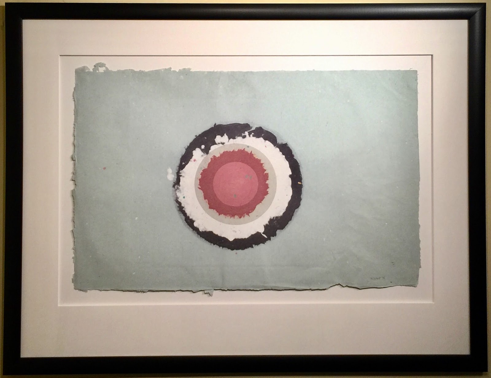
Circle II, I-7, from Handmade Paper Project, 1978 by Kenneth Noland


Circle II, I-7, from Handmade Paper Project, 1978; Handmade paper composed of five layers of colored paper pulp with one monotype litho printing; Signed & dated Noland 78 in pencil bottom right; Published by Tyler Graphics, Ltd., Bedford, New York, with their blindstamp lower right; Annotated I-7 in pencil left verso; Size - 21 x 32", Frame 34 1/2 x 44 1/2"; Framed with a black wood frame, floated and acid free matted, and plexiglass.

To purchase this work or to visit the Art Gallery, CLICK HERE

"I knew what a circle could do. Both eyes focus on it. It stamps itself out, like a dot. This, in turn, causes one's vision to spread, as in a mandala in Tantric art." - Kenneth Noland

In October of 1952 Helen Frankenthaler, after a trip to Nova Scotia, had a breakthrough with a painting entitled "Mountains and Sea." The painting was abstract and rather than painting the landscape that she saw on her trip, the work portrayed the experience itself. The abstract image was painted using a "soak stain" technique, whereby unprimed canvas duct is painted using oil paint that had been heavily thinned with turpentine. The effects of the technique reinforced the abstract nature of the landscape painting; and when the artists Kenneth Noland and Morris Louis saw it in her studio in New York, their own painting styles were forever changed.


Close up of Circle II, I-13, from Handmade Paper Project, 1978 by Kenneth Noland.

On the train ride back to Washington DC, Noland and Louis realized that Frankenthaler's painting was their key to finding their own paths. Each made the decision to disregard all his own prior work and begin fresh. Noland stated, "We were interested in Pollock but could gain no lead from him. He was too personal. But Frankenthaler showed us a way - a way to think about and use color." Morris Louis found is structure for his color field paintings first with the unfurl series; and soon after Kenneth Noland found his, with the circle paintings. "I knew what a circle could do. Both eyes focus on it. It stamps itself out, like a dot. This, in turn, causes on's vision to spread, as in a mandala in Tantric art," Kenneth Noland.


Close up of the signature, date, and Tyler Graphics, Ltd. blindstamp.

The circle paintings in the 1960's were Noland's first color format; but would be followed over the years by chevrons, strips, plaids, and irregular paintin series. Noland would return to these early formats in the 1990's using opaque and bold acrylics, however the soak stain technique from the 1960's are by far his greatest achievement.

From Judith Goldman "Kenneth Noland Handmade Papers," 1978:
"From April to August 1978, Kenneth Noland made images out of paper at Tyler Graphics in Bedford, New York. Working with oriental and western fibers and bits of colored paper, he produced oer 200 images. The results were staggering. At first glance, many images seem quite like each other. But no two are the same. Colors vary from filmy blues and bright yellows to soft purples and murky greys. Textures range from wafer-thin oriental surfaces, thick as encrusted cardboard. In some pieces image prevail; in some, structure does. Paper-making is never the point, for Noland, it is a way to explore color and create texture."


Close up of the annotated I-7 in pencil left verso.

The handmade paper works of art completed at Tyler Graphics fall into four categories. The Circle I Series were composed of three layers of colored pulp with three monotype litho printings. The sheet size was 20 x 16" oriented either vertical or horizontal. The Horizontal Stripes Series I-IV were varied by both size and the number of layers of colored pulp. The Diagonal Stripes Series were composed of eight layers of colored pulp. However, the greatest works of art created within the entire handmade paper project were the Circle II Series of artworks. These pieces were his larges circles, and it this format of color field painting that Kenneth Noland is most recognized. The Circle II Series were composed of five layers of colored pulp with one monotype litho printing. The sheet size was 32 x 21" oriented either vertical or horizontal.


Framed Circle II, I-13, from Handmade Paper Project, 1978 by Kenneth Noland.

This is an absolutely amazing Handmade Paper Circle Painting by Kenneth Noland! The inner circle is a soft pink red with outward circles of red, grey, white, and black. The ground is a rich washed grey; that further enhances the interactions of the color fields, overall composition, and balance. To further activate the surface, there are colored fibers and bits of green paper scattered throughout the work. A beautiful addition to any art collection!

Friday, June 9, 2017

Circle II, I-13, from Handmade Paper Project, 1978 by Kenneth Noland

Circle II, I-13, from Handmade Paper Project, 1978; Handmade paper composed of five layers of colored paper pulp with one monotype litho printing; Signed & dated Noland 78 in pencil bottom right; Annotated I-13 in pencil left verso; Published by Tyler Graphics, Ltd., Bedford, New York, with their blindstamp lower right; Andre Emmerich Gallery sticker on verso of frame; Size - 21 x 32", Frame 22 x 33"; Framed floated on a white mat, silver frame, & plexiglass.
To purchase this work or to visit the Art Gallery, CLICK HERE

"I knew what a circle could do. Both eyes focus on it. It stamps itself out, like a dot. This, in turn, causes one's vision to spread, as in a mandala in Tantric art." - Kenneth Noland 

In October of 1952 Helen Frankenthaler, after a trip to Nova Scotia, had a breakthrough with a painting entitled "Mountains and Sea." The painting was abstract and rather than painting the landscape that she saw on her trip, the work portrayed the experience itself. The abstract image was painted using a "soak stain" technique, whereby unprimed canvas duct is painted using oil paint that had been heavily thinned with turpentine. The effects of the technique reinforced the abstract nature of the landscape painting; and when the artists Kenneth Noland and Morris Louis saw it in her studio in New York, their own painting styles were forever changed.


Close up of Circle II, I-13, from Handmade Paper Project, 1978 by Kenneth Noland.

On the train ride back to Washington DC, Noland and Louis realized that Frankenthaler's painting was their key to finding their own paths. Each made the decision to disregard all his own prior work and begin fresh. Noland stated, "We were interested in Pollock but could gain no lead from him. He was too personal. But Frankenthaler showed us a way - a way to think about and use color." Morris Louis found is structure for his color field paintings first with the unfurl series; and soon after Kenneth Noland found his, with the circle paintings. "I knew what a circle could do. Both eyes focus on it. It stamps itself out, like a dot. This, in turn, causes on's vision to spread, as in a mandala in Tantric art," Kenneth Noland.


Close up of the signature, date, and Tyler Graphics, Ltd. blindstamp.


Close up of the annotated I-13 in pencil left verso.

The circle paintings in the 1960's were Noland's first color format; but would be followed over the years by chevrons, strips, plaids, and irregular paintin series. Noland would return to these early formats in the 1990's using opaque and bold acrylics, however the soak stain technique from the 1960's are by far his greatest achievement.


Framed Circle II, I-13, from Handmade Paper Project, 1978 by Kennthe Noland.

From Judith Goldman "Kenneth Noland Handmade Papers," 1978:
"From April to August 1978, Kenneth Noland made images out of paper at Tyler Graphics in Bedford, New York. Working with oriental and western fibers and bits of colored paper, he produced oer 200 images. The results were staggering. At first glance, many images seem quite like each other. But no two are the same. Colors vary from filmy blues and bright yellows to soft purples and murky greys. Textures range from wafer-thin oriental surfaces, thick as encrusted cardboard. In some pieces image prevail; in some, structure does. Paper-making is never the point, for Noland, it is a way to explore color and create texture."


Close up of the Andre Emmerich Gallery sticker on verso of frame.

The handmade paper works of art completed at Tyler Graphics fall into four categories. The Circle I Series were composed of three layers of colored pulp with three monotype litho printings. The sheet size was 20 x 16" oriented either vertical or horizontal. The Horizontal Stripes Series I-IV were varied by both size and the number of layers of colored pulp. The Diagonal Stripes Series were composed of eight layers of colored pulp. However, the greatest works of art created within the entire handmade paper project were the Circle II Series of artworks. These pieces were his larges circles, and it this format of color field painting that Kenneth Noland is most recognized. The Circle II Series were composed of five layers of colored pulp with one monotype litho printing. The sheet size was 32 x 21" oriented either vertical or horizontal.
This is an absolutely amazing Handmade Paper Circle Painting by Kenneth Noland! The inner circle is yellow, with outward circles of orange, red, pale red, and blue. The ground is a rich sea foam green, that further enhances the interactions of the color fields, overall composition, and balance. A wonderful addition to any art collection.

Monday, May 8, 2017

"Danseuse Debout, Acoudée (Standing Dancer, Leaning)," 1927 by Henri Matisse


Danseuse Debout, Acoudée (Standing Dancer, Leaning), 1927; Lithograph on Japon paper; Signed Henri Matisse and numbered 15/15 in pencil lower right; Published by Galerie D'Art Contemporain de Paris; Catalog Raisonne: Duthuit 482; Size - Image 18 x 11"; Sheet 19 1/2 x 12 3/4", Frame 32 3/4 x 25 1/2"; Framed with a gold wood frame, two acid free linen mats, a gold fillet, and UV Plexiglass.

To purchase this work or to visit the Art Gallery, CLICK HERE!

"What I dream of is an art of balance, of purity and serenity devoid of troubling or depressing subject matter - a soothing, calming influence on the mind, rather like a good armchair which provides relaxation from physical fatigue.” – Henri Matisse

Henri-Émile-Benoît Matisse (1869 – 1954) was a French artist who was known for both his use of colour and his original draughtsmanship. He is commonly regarded, along with Pablo Picasso, as one of the twentieth century’s greatest artists who redefined the visual arts of painting and sculpture. Although he was initially labelled a Fauve (wild beast), by the 1920s he was increasingly being hailed as a leader in the classical tradition of French painting. His artistic creation spanned over a half-century, and he is now considered a leading figure in the modern art movement.

Although Matisse is better known as a painter and sculptor, he became an avid print maker starting in 1906. His preferred medium was lithography, which he utilized in the creation of illustrations for books and over 100 original limited edition lithographs. The majority of the lithographs were executed in black and white, thus maintaining the sense of spontaneity and intimacy inherit in his pencil drawings. As with his paintings and sculptures, original lithographs are currently in world renowned permanent collections of major private and public institutions; including the Museum of Modern Art in New York, Tate Modern, and the Guggenheim.


Close up of the edition number and the Henri Matisse pencil signature.

 
Framed image of "Danseuse Debout, Acoudée (Standing Dancer, Leaning)," 1927 by Henri Matisse.

"Danseuse Debout, Acoudée (Standing Dancer, Leaning)," 1927 is a wonderful lithograph with the subject being a beautiful ballet dancer wearing a fitted flower covered bodice and a crinoline tutu that is tied at the waist with flowers and a bow. The artwork is instantly recognized as being from the hand of Matisse, as it is executed in his loose drawing style. One only need to look at the subject's face to see Matisse's great economy of lines, that form a balanced composition. The use of contour and value, in order to convey both a sense of softness and depth, makes the execution of the artwork exceptional. The standing dancer is leaning with her head resting in the palm of her right hand. Her gaze is fixed into the distance, implying a daydream state; and she does not appear to notice that she is being seen by the viewer. Her background is abstracted and washed out, focusing the attention only on the beautiful ballerina. The resulting composition is relaxed and calm, creating a peaceful daydream like escape for both the subject and the viewer. This is a spectacular, large, rare, and early work by Henri Matisse; and a great addition to any art collection!

Tuesday, May 2, 2017

"Portraits Of The Artists," 1967 by Andy Warhol


Portraits Of The Artists, 1967; Screenprints on 100 polystyrene boxes in ten colors; Incised initials AW & numbered 152/200 in the Warhol lower right blue box; Artists left to right: Lee Bontecou, Frank Stella, Larry Poons, Robert Morris, Donald Judd, Robert Rauschenberg, James Rosenquist, Roy Lichtenstein, Jasper Johns, & Andy Warhol; Published by Tanglewood Press, Inc., NY; Size - 20 3/4 x 20 3/4 x 1 1/2"; Catalog Raisonne: Feldman/Schellmann: II.17; Framed in a plexibox.


"My fascination with letting images repeat and repeat - or in film's case 'run on' - manifests my belief that we spend much of our lives seeing without observing." - Andy Warhol

Andy Warhol became part of a very exclusive group of artists that the famous and influential New York dealer, Leo Castelli, represented. Castelli (1907 - 1999) was an Italian-American art dealer. His New York gallery showed modern and contemporary artwork for five decades. Among the art movements which were covered included: Surrealism, Abstract Expressionism, Neo-Dada, Pop Art, Op Art, Color Field, Hard-edge Geometric, Lyrical Abstraction, Minimalism, Conceptual Art, and Neo-expressionism.


Close up of the Andy Warhol incised initials, A. W.


Close up of the edition number 152/200.

In 1967, David Whitney organized an exhibition to commemorate the tenth anniversary of the Leo Castilli Gallery. The show was entitled "Leo Castelli Ten Years," was held February 4-26, and included sixteen gallery artists. Andy Warhol's contribution (who came to the gallery late, after having two shows at Eleanor Ward’s Stable Gallery) to the show was a series of individual canvas portraits of twelve of the gallery artists: Lee Bontecou, John Chamberlain, Frank Stella, Larry Poons, Robert Morris, Donald Judd, Robert Rauschenberg, James Rosenquist, Roy Lichtenstein, Jasper Johns, Cy Twombly, and himself. The photographs of the artists were provided by the Castelli Gallery and Warhol then both cropped and enlarged them to created a silkscreen. The individual portrait images were then screened onto single colored canvases and were hung in the gallery foyer.


Close up of the top four rows of "Portraits Of The Artists," 1967 by Andy Warhol.

In early 1967 Tanglewood Press published a Portfolio entitled "Ten Faces of Leo Castelli," also to commemorate the tenth anniversary of the Leo Castilli Gallery. Warhol's contribution was a variant of his work for the Castelli exhibition. The work was entitled "Portraits of the Artists" and depicts the same portrait images of ten of the Castelli artists (Chamberlain and Twombly were not included). Warhol screenprinted each portrait using black ink onto ten different colored 3-D polystyrene boxes, each measuring approximately 2” x 2”. The boxes were then put into a frame, but they were not attached to each other; thus allowing the owner to rearrange the boxes in any order (Note: The order pictured seems to be the original published orientation). The framed 100 boxes form a square work of art approximately 20” x 20” and the artists pictured here are left to right: Lee Bontecou, Frank Stella, Larry Poons, Robert Morris, Donald Judd, Robert Rauschenberg, James Rosenquist, Roy Lichtenstein, Jasper Johns, and Andy Warhol.


Close up of the bottom six rows of "Portraits Of The Artists," 1967 by Andy Warhol.

"Portraits Of The Artists," 1967 is one of Warhol's greatest editioned works from the 1960's; the high period for Pop Art. The work certainly references the portrait that Warhol created for Ethel Scull, whose father was a wealthy taxi cab owner. "Ethel Scull 36 Times," 1963 was a series of equally sized portraits of Scull varying only in the portrait pose and the background color of the canvas. The 36 canvass, like "Portraits Of The Artists," could be rearranged into any order that most appealed to the owner. Both works illustrate the wonderful use of Warhol's fascination with repetition. For "Portraits Of The Artists," 1967 because the portrait is screened onto the top of a colored box, there is a shadow created on the bottom; further adding to the multiplicity of the portrait image. The edition for the multiple is only 200, however because so many from the edition are part of major art museums throughout the world (including the Museum of Modern Art and The Andy Warhol Museum), this is a wonderful opportunity to obtain a very rare, original, and important piece of Andy Warhol 1960's artwork!

"Isn't life a series of images that change as they repeat themselves?" - Andy Warhol

Friday, March 31, 2017

"October 1981 Rangeley, Maine, 1982" by William Wegman


October 1981 Rangeley, Maine, 1982; Color Dye Transfer; Signed, titled, and Numbered 20/75 in white ink lower right; Published by Anthology Film Archives, New York; Printed by Stewart Color Laboratories, New York; Size - Sheet: 25" x 20 1/2", Image 19 1/2 x 19", Mat 32 x 26"; Framed with a single acid free mat, brown wood frame, and UV plexiglass.

To purchase this work or to visit the Art Gallery, CLICK HERE!

William Wegman (b. 1943) is an American artist best known for creating artistic photographic and video compositions involving dogs, primarily his own Weimaraners in various costumes and poses. The dogs were cast in poses and characters, often using ingenious props and elaborate costumes that were imitative of human beings. Wegman also used camouflage and draping to disguise these physical changes of his dogs as they aged.


Close up of "October 1981 Rangeley, Maine, 1982" by William Wegman

While Wegman was in Long Beach, he got his Weimaraner dog which he named Man Ray. Man Ray would become his muse, and thus began a long and very fruitful collaboration. Man Ray was known for his endearing deadpan presence, became the central figure in Wegman's photographs and videos.


Close up of the signature, title, and date.

Seeking a refuge from his New York City life, Wegman spent many summers in Maine, which he described as: “Nothing bad happens in Maine—a real Hardy Boys setting. The villains steal firewood or ride ATVs on private property or fish where they should not. Sometimes you encounter a grumpy ornery person who acts suspicious or who is suspicious. What’s there to do in Maine? You can read books and magazines. Paint. Draw. Take pictures. Fish. Hike. Listen to the loons.”


Matted "October 1981 Rangeley, Maine, 1982" by William Wegman 

Framed "October 1981 Rangeley, Maine, 1982" by William Wegman.

October 1981, Rangeley, Maine is a brightly colored dye transfer photograph set in the Maine woods at the peak of fall foliage. A tall dark tree dominates the central axis, in front of which is the cleverly hidden and barely perceptible figure of Man Ray, covered and camouflaged with red, yellow, and green leaves. Above him and attached to the tree is a sign bearing the legend:

State
Game Preserve
No hunting
Trapping or Firearms
—Allowed—
Inland Fisheries and
Game Department

Like much of Wegman’s work, this image is both witty and ironic. The State Game Preserve sign shows signs of being used for target practice, most likely by game hunters. Weimaraners are working dogs and very good for hunting, however Man Ray is forbidden from hunting; and therefore he is camouflaged to escape being detected. This is large work is exceptionally nice and showcases William Wegman at his best! This is one of the last photographs taken of Man Ray, as he passed away in 1982.

Wednesday, March 29, 2017

"Untitled," 1982; by Robert Rauschenberg


Untitled, 1982; Serigraph on Arches Cover paper; Signed Rauschenberg, numbered 20/75, and dated 82 in pencil lower right; Printers chop mark lower left; Published by Anthology Film Archives, New York; Printed by Styria Studio, New York; Size - Sheet: 29 x 21 1/2"; Unframed.

To purchase this work or to visit the Art Gallery, CLICK HERE!

Milton Ernest "Robert" Rauschenberg (1925 – 2008) was an American artist whose early works anticipated the Pop Art movement. He is most known for his "Combines" of the 1950s, in which non-traditional (often found) materials and objects were used in innovative combinations. Rauschenberg also worked in the mediums of photography, printmaking, papermaking, and performance art. He was awarded the National Medal of Arts in 1993.

Most of Rauschenberg’s printmaking consists of visual collages drawn from a variety of source material. "Untitled," 1982 was created using photo-screenprinting of images that he appropriated from various sources including sports, technology, and advertising. The images were then arranged with little regard to scale or the formal rules of composition. The most striking and readable image is a photograph of a javelin thrower in the lower left, located directly above oil derricks or construction cranes with workers positioning a steel tower. The angle of the crane mirrors the right leg of the athlete, thus balancing the composition. There is a washed-out photograph of a technician working on a computer motherboard, and an image of a start to a cross-country skiing race that was rotated ninety degrees to the left. There are brightly colored cafeteria trays, stacked bowls, plates, knives, forks, and spoons (also a rotated image) seen above. Down from the upper left corner is a band of bright orange-red color, with a puzzle pattern that runs across the composition almost to the middle of the image.


Close up of the Rauschenberg signature, edition number, and date.


Close up of the Styria Studio printer's mark.

It is impossible to read and comprehend every part of the work, which is exactly the point. The images are used and combined with forms and colors to create a work of art that is both representational and abstract. It is the overall impression of the work that is important. Rauschenberg was not interested in creating reality, as he has stated: “Any incentive to paint is as good as any other. There is no poor subject. Painting is always strongest when in spite of composition, color, etc. it appears as a fact, or an inevitability, as opposed to a souvenir or arrangement. Painting relates to both art and life. …I try to act in that gap between the two.”